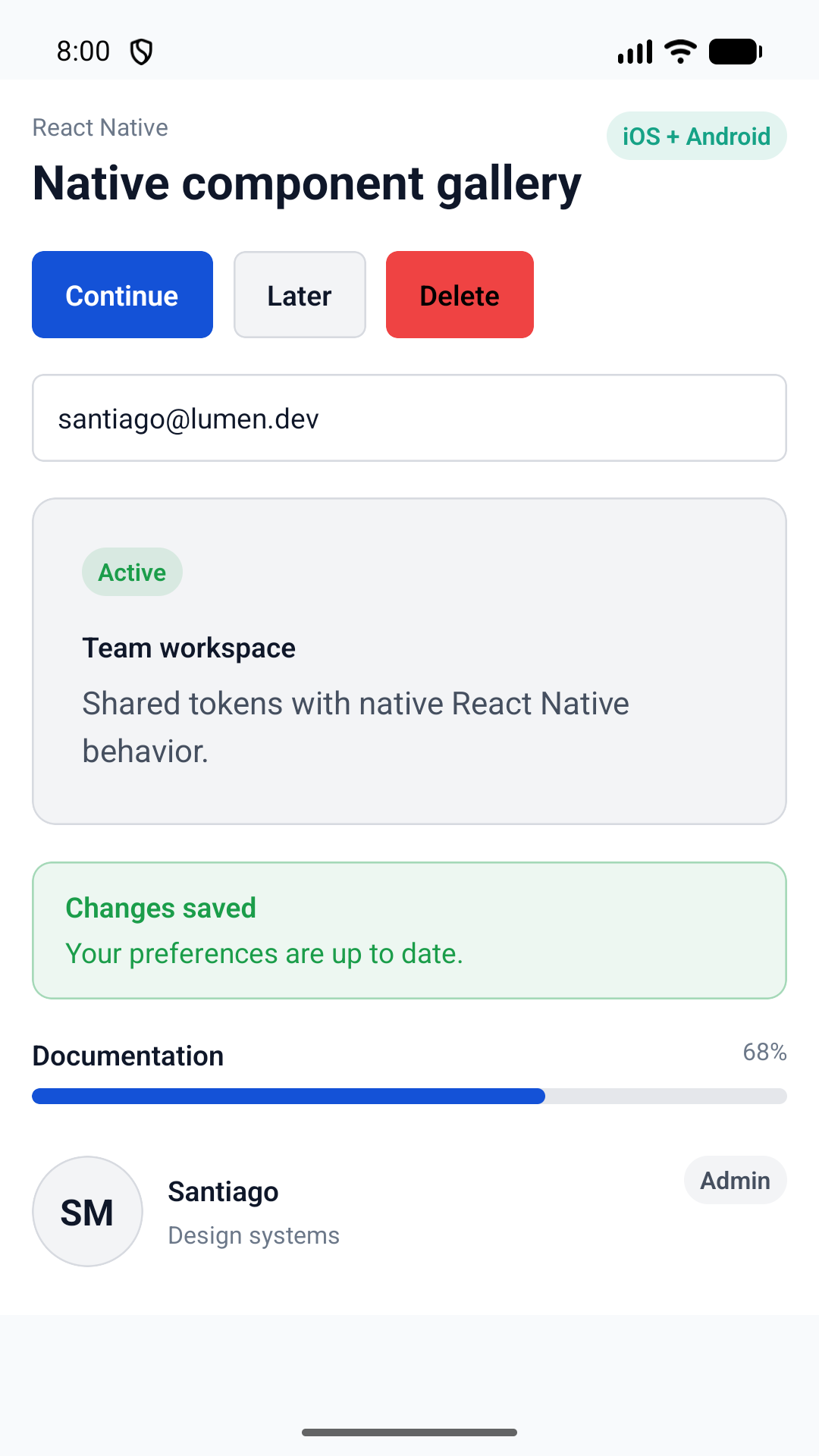
LumenProvider
Theme
Provide generated semantic colors, spacing, radii, typography, motion, and elevation to native components.
Explore all 61 components available for React Native. Each reference page includes real native usage, the public API, design guidance, and accessibility behavior.
Component library
No components match that search.
Provide generated semantic colors, spacing, radii, typography, motion, and elevation to native components.
Render native text with shared typography variants and semantic color tones.
Trigger a native action with a required accessible label and platform icon.
Run native actions with shared intent, size, loading, and disabled contracts.
Represent compact selected, actionable, or removable values with native interaction semantics.
Present a native anchored action menu with shared item-state semantics.
Open the operating system share surface from a token-aware native action.
Collect a single line of text using each platform’s native input and focus behavior.
Capture multiline native text with shared labeling, supporting copy, and error treatment.
Compose related native controls under one label, description, required state, and validation message.
Present a labeled native switch with Lumen brand tint.
Align a setting title and explanation with an optional graphic and trailing native control.
Choose one controlled value through native or accessible menu presentation.
Adjust a continuous or stepped numeric value with a visible formatted label.
Filter native content with a density-aware search field and clear action.
Enter an international phone number with searchable countries, calling codes, formatting, validation, and E.164 output.
Capture a controlled Boolean choice with a generous native target and supporting text.
Choose one value from a visible, labeled group of native radio options.
Choose one value from a compact row of short peer options.
Select a native date with bounds and validation context.
Select an inclusive native date range with coordinated bounds and validation context.
Compose content on semantic native backgrounds with shared padding and radius roles.
Separate related native content with the shared semantic line role.
Group related native content on a bordered semantic surface with optional card-level action.
Reveal optional native content through a controlled, accessible disclosure trigger.
Lay out a small set of related native actions horizontally or vertically.
Compose a flexible native row with leading identity, content, and trailing actions.
Identify a native section with optional supporting copy, count, and trailing actions.
Present supplemental application content in a controlled native sheet.
Switch a controlled native content panel from an accessible tab list.
Select among peer application destinations with native visuals and controlled state.
Animate a React Native destination bar in response to native vertical scroll travel.
Place compact application status or actions above React Native bottom navigation.
Render a compact tokenized trend line with optional area fill.
Compare one or more categorical, numeric, or temporal line series.
Compare grouped or stacked categorical magnitudes.
Show a small positive part-to-whole breakdown as a pie or donut.
Plot numeric scatter and bubble relationships with semantic series tones.
Encode a two-dimensional matrix with the canonical sequential scale.
Render ordered low-to-high intervals as a tokenized range band.
Combine bar, line, and area series on one shared value domain.
Display the complete shared interface and brand catalog, with platform-native escape hatches.
Display compact native status and classification labels using semantic tones.
Display a native image or fallback identity at shared avatar sizes.
Display a compact product metric with semantic tone and optional supporting context.
Show a normalized circular native metric with a formatted accessible value.
Frame application-provided artwork with token-aware glow, grid, or orbit decoration.
Place a token-aware ambient pattern behind native application content.
Present native images with shared fit, ratio, radius, and accessibility behavior.
Communicate an indeterminate native loading state with a semantic brand treatment.
Present inline native feedback using shared neutral, destructive, success, and warning treatments.
Show normalized determinate progress with native accessibility semantics.
Represent loading text, rectangles, and circles with quiet semantic placeholders.
Present app-controlled transient native feedback with semantic tone and optional actions.
Explain missing content with supporting copy, an optional graphic, and a recovery action.
Explain an unavailable region or page and offer application-owned recovery.
Present a structured semantic notice with optional actions and dismissal.
Present compact textual application status with optional trailing content.
Apply Lumen semantic colors to React Native pull-to-refresh behavior.
Render a built-in empty, success, error, or offline semantic scene.
Request a controlled native confirmation with explicit cancel and confirm states.
Interactive component gallery
Explore the React Native components and their interactive states directly in the browser.