Interface icons
Use search. Enumerate every supported name with lumenIconNames.
Trigger a native action with a required accessible label and platform icon.
Native example
Use for compact, familiar actions. Prefer a text button when the icon alone would make the action difficult to understand.
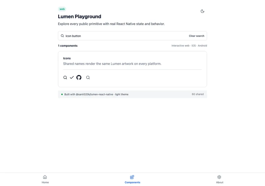
<LumenIconButton
  name="settings"
  label="Settings"
  onPress={openSettings}
/>
React Native icon catalog
Search the visual catalogs, copy the displayed Lumen name, then use the React Native spelling below. The package includes both catalogs without another native dependency.
Reference
The primary shared and platform-specific options exposed by LumenIconButton.
| API | Values or type | Default | Description |
|---|---|---|---|
| name or icon | LumenIconName or LumenIconGraphic | Exactly one required | Selects a generated catalog icon or a platform-specific custom graphic. |
| label | String | Required | Provides the accessible action name. |
| onPress | Callback | Required | Runs the action. |
| intent | primary · secondary · quiet · danger | quiet | Selects the semantic action treatment. |
| size | sm · md · lg | md | Selects shared icon and control metrics. |
| disabled | Boolean | false | Controls native disabled state. |
Native behavior
Use for compact, familiar actions. Prefer a text button when the icon alone would make the action difficult to understand.
The accessible label is required and becomes the native button name. Touch targets remain at least 44 units on mobile.
Shared component