When to use it
Use for multi-line freeform input. Prefer Text field for short single-line values and keep validation messages concise.
Capture multiline native text with shared labeling, supporting copy, and error treatment.
Native example
Use for multi-line freeform input. Prefer Text field for short single-line values and keep validation messages concise.
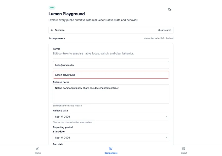
<LumenTextarea
  label="Release notes"
  value={notes}
  onChangeText={setNotes}
  description="Summarize the visible changes."
/>
Reference
The primary shared and platform-specific options exposed by LumenTextarea.
| API | Values or type | Default | Description |
|---|---|---|---|
| label | String | Required | Provides the visible and accessible label. |
| value | string | Required | Stores the controlled text value. |
| onChangeText | (String) -> Unit | Required | Updates the controlled text value. |
| description | String? | nil | Adds supporting input guidance. |
| errorMessage | String? | nil | Marks and explains an invalid value. |
Native behavior
Use for multi-line freeform input. Prefer Text field for short single-line values and keep validation messages concise.
The native multiline editor keeps platform text-entry behavior, exposes its visible label, and presents supporting or error context without replacing the current value.
Shared component