Install from Maven Central
Add implementation("com.santi020k:lumen-compose:2.1.0") to the application module.
Use the shared Lumen foundations through Jetpack Compose and Material 3 while preserving Android interaction and accessibility conventions.
com.santi020k:lumen-composeInstall com.santi020k:lumen-compose:2.1.0 for Android apps. Add com.santi020k:lumen-compose-wear:2.1.0 only to a Wear OS module, then wrap content in the appropriate Lumen theme.
Get started
Install com.santi020k:lumen-compose:2.1.0 for Android apps. Add com.santi020k:lumen-compose-wear:2.1.0 only to a Wear OS module, then wrap content in the appropriate Lumen theme.
Add implementation("com.santi020k:lumen-compose:2.1.0") to the application module.
For a watch target, add implementation("com.santi020k:lumen-compose-wear:2.1.0") to the Wear module. Keep it out of phone and tablet modules that do not render Wear UI.
Wrap application content in LumenTheme. It follows the system appearance by default and keeps Lumen and Material 3 content aligned.
Sync Gradle, then run an emulator, a connected Android device, or build a debug APK.
// app/build.gradle.kts
repositories {
    mavenCentral()
}

dependencies {
    implementation("com.santi020k:lumen-compose:2.1.0")
}// wear/build.gradle.kts
repositories {
mavenCentral()
}
dependencies {
implementation("com.santi020k:lumen-compose-wear:2.1.0")
}import com.santi020k.lumen.LumenTheme
LumenTheme {
LumenSurface {
LumenText("Welcome", variant = LumenTextVariant.Title)
LumenButton(onClick = ::continueFlow) {
Text("Continue")
}
}
}Try every component
Open the Android playground directory in Android Studio, let Gradle sync, select an emulator or connected device, and press Run. The command-line build writes a directly installable debug APK under the app build directory.
The Android release is still awaiting Google Play approval. Until it is approved, run the local Compose playground or build the debug APK from the repository.
git clone https://github.com/santi020k/lumen.git
cd lumen
pnpm playground:android:buildopen apps/playground-androidYou can run the gallery locally before configuring any store account.
Appearance
LumenTheme follows the device appearance by default and maps Lumen semantic colors into Material 3. Pass darkTheme explicitly only when the application offers its own saved appearance preference.
LumenTheme {
    AppNavigation()
}var useDarkTheme by rememberSaveable { mutableStateOf(false) }
LumenTheme(darkTheme = useDarkTheme) {
AppNavigation()
}LumenTheme provides both LocalLumenTheme and MaterialTheme. Prefer Lumen components and semantic roles so Lumen and Material content stay visually consistent inside the same hierarchy.
Continue with AI
Install the portable skill once, open your application in a compatible coding tool, and name the target platform in the request. The skill reads the native package and documentation before selecting components.
npx skills add santi020k/lumen --skill lumen-uinpx skills add santi020k/lumen --skill lumen-uiFollow the installer prompts and select the AI coding tools available on your machine.
Use $lumen-ui to build this screen with Jetpack Compose.
Use the local lumen-compose module, LumenTheme, and public Compose components.
Preserve Android navigation and state, and include loading, empty, error, and TalkBack behavior.
Use $lumen-ui to build this screen with Jetpack Compose.
Use the local lumen-compose module, LumenTheme, and public Compose components.
Preserve Android navigation and state, and include loading, empty, error, and TalkBack behavior.Review the generated package imports, component states, and platform accessibility behavior.
The Agent Skill and optional MCP server cover web and native adapters. MCP can list the components available for this platform and return installation, setup, API examples, accessibility guidance, and reference source for each documented native component.
Open the complete AI setup guideReal platform output
This verified capture comes from the native preview host using the package in this repository. The controls are rendered by Android, not by HTML.
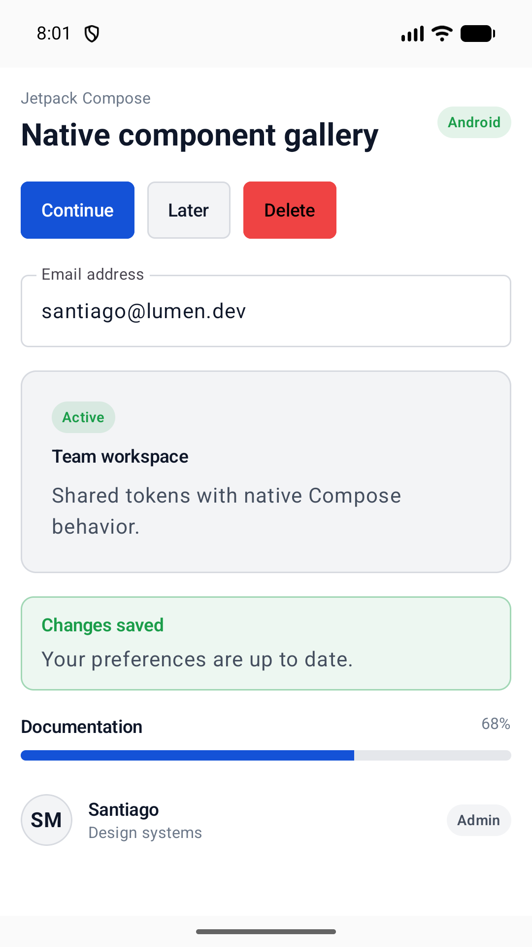
Supported surface
Compose implements the shared native tier using Kotlin and Material 3 conventions. Watch-only primitives ship separately so phone and tablet applications do not acquire Wear dependencies.
Platform contract
Generated colors, dimensions, typography, motion, and elevation map into Compose-native values.
LumenTheme maps the shared semantic palette into Material 3 while exposing the full token object.
Components preserve native focus, state, input, and TalkBack semantics.
Move between platform guidance without losing the shared Lumen design language.