When to use it
Use for native date input that needs Lumen supporting and validation context. SwiftUI also supports time and combined date-time input.
Native example
Use for native date input that needs Lumen supporting and validation context. SwiftUI also supports time and combined date-time input.
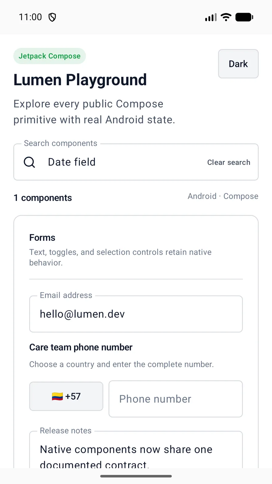
LumenDateField(
    label = "Release date",
    value = releaseDateMillis,
    onValueChange = { releaseDateMillis = it },
    minDateMillis = todayUtcMillis,
    description = "Choose when this version becomes available."
)
Reference
The primary shared and platform-specific options exposed by LumenDateField.
| API | Values or type | Default | Description |
|---|---|---|---|
| label | String | Required | Labels the native date picker. |
| value / onValueChange | Long? / (Long) -> Unit | Required | Stores the selected native date value. |
| — | — | — | Chooses the visible date and time parts. |
| minDateMillis / maxDateMillis | Long? | null | Constrains selection using native picker bounds. |
| description / errorMessage | String? | null | Shows supporting text or a semantic danger validation message. |
Native behavior
Use for native date input that needs Lumen supporting and validation context. SwiftUI also supports time and combined date-time input.
The native picker retains its label and adjustable behavior. Supporting or validation text remains visible in the same contained group.
Shared component