When to use it
Use for an independently selectable Boolean choice. Prefer Toggle when changing the value applies immediately as a setting.
Capture a controlled Boolean choice with a generous native target and supporting text.
Native example
Use for an independently selectable Boolean choice. Prefer Toggle when changing the value applies immediately as a setting.
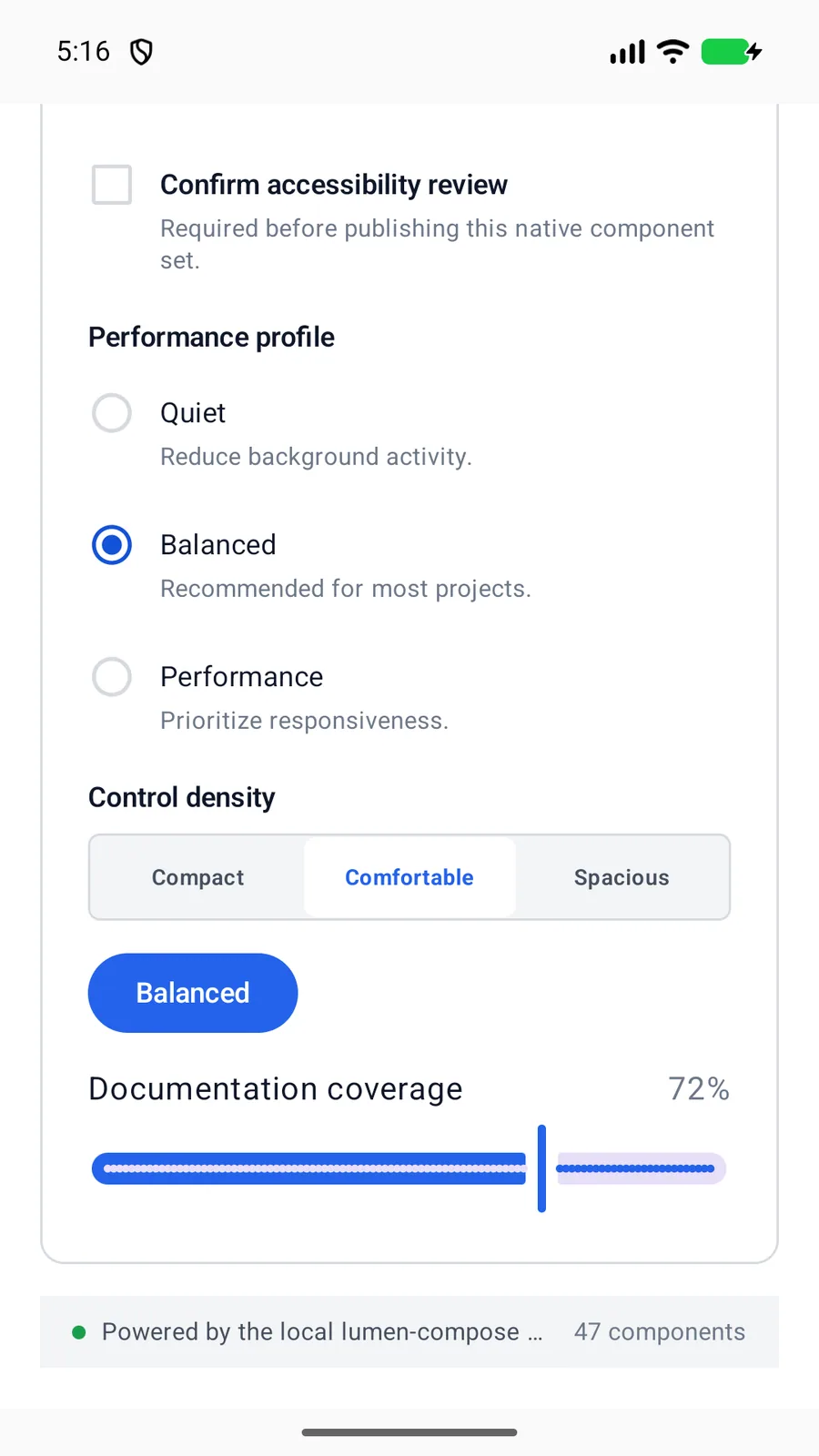
LumenCheckbox(
    label = "Share analytics",
    checked = sharesAnalytics,
    onCheckedChange = ::setSharesAnalytics
)
Reference
The primary shared and platform-specific options exposed by LumenCheckbox.
| API | Values or type | Default | Description |
|---|---|---|---|
| label | String | Required | Provides the visible and accessible label. |
| checked | Boolean | Required | Stores the controlled checked state. |
| onCheckedChange | (Boolean) -> Unit | Required | Updates the controlled state. |
| description | String? | nil | Adds optional supporting text. |
| enabled | Boolean | true | Controls native disabled state. |
Native behavior
Use for an independently selectable Boolean choice. Prefer Toggle when changing the value applies immediately as a setting.
The full labeled row is a native checkbox target and exposes checked and disabled state without duplicating the visual indicator.
Shared component