When to use it
Use default and muted cards for grouped content, and restrained semantic variants when the surface conveys a real state. Provide a card-level action only when the entire card performs one action.
Group related native content on a bordered semantic surface with optional card-level action.
Native example
Use default and muted cards for grouped content, and restrained semantic variants when the surface conveys a real state. Provide a card-level action only when the entire card performs one action.
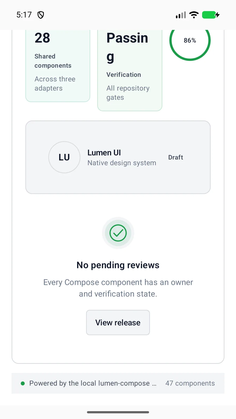
LumenCard(variant = LumenCardVariant.Muted) {
    LumenText("Team workspace")
}
Reference
The primary shared and platform-specific options exposed by LumenCard.
| API | Values or type | Default | Description |
|---|---|---|---|
| variant | default · muted · accent · success · warning · destructive | default | Selects the native surface treatment. |
| onClick | Optional callback | nil | Makes the whole card interactive. |
| content | Native content | Required | Composes the card body. |
| modifier | Native layout API | — | Controls card placement and sizing. |
Native behavior
Use default and muted cards for grouped content, and restrained semantic variants when the surface conveys a real state. Provide a card-level action only when the entire card performs one action.
Supplying an action gives the card native button semantics. Avoid nesting an interactive card inside another control.
Shared component