When to use it
Mount the theme once near the application root. Read semantic roles from the native theme object instead of copying hexadecimal values into feature code.
Provide generated semantic colors, spacing, radii, typography, motion, and elevation to native components.
Native example
Mount the theme once near the application root. Read semantic roles from the native theme object instead of copying hexadecimal values into feature code.
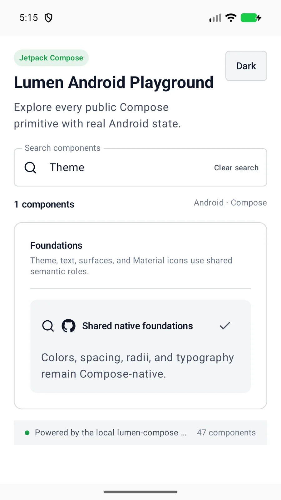
LumenTheme(darkTheme = false) {
    AppContent()
}
Reference
The primary shared and platform-specific options exposed by LumenTheme.
| API | Values or type | Default | Description |
|---|---|---|---|
| darkTheme | Boolean | System setting | Selects the active native color scheme. |
| content | @Composable () -> Unit | Required | Provides Lumen theme values to the descendant tree. |
Native behavior
Mount the theme once near the application root. Read semantic roles from the native theme object instead of copying hexadecimal values into feature code.
The active color scheme follows the platform environment unless the application chooses an explicit light or dark mode.
Shared component