When to use it
Use for short at-a-glance progress. Keep long-running background work, Always On policy, and timeline updates application-owned.
Surround wearable content with clamped semantic circular progress.
Native example
Use for short at-a-glance progress. Keep long-running background work, Always On policy, and timeline updates application-owned.
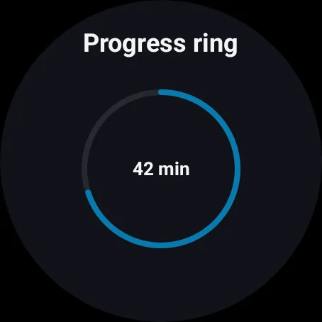
LumenWearProgressRing(value = elapsed, maximum = threshold) {
    TimerLabel()
}
Reference
The primary shared and platform-specific options exposed by LumenWearProgressRing.
| API | Values or type | Default | Description |
|---|---|---|---|
| value | Finite numeric value | Required | Provides current progress. |
| maximum | Positive numeric value | 1 | Defines the upper bound. |
| tone | brand · accent · success · warning · danger · neutral | brand | Applies semantic progress color. |
| lineWidth | Native display units | 4 | Controls the clamped ring stroke. |
| content | Native view slot | Required | Provides application-owned center content. |
Native behavior
Use for short at-a-glance progress. Keep long-running background work, Always On policy, and timeline updates application-owned.
Exposes a normalized progress range while application-owned inner content retains its own readable semantics.
Shared component