When to use it
Use for short at-a-glance progress. Keep long-running background work, Always On policy, and timeline updates application-owned.
Surround wearable content with clamped semantic circular progress.
Apple availability
Import LumenUI in the target that uses this component. iPad support follows the iOS package baseline and uses native iPad layout behavior.
Native example
Use for short at-a-glance progress. Keep long-running background work, Always On policy, and timeline updates application-owned.
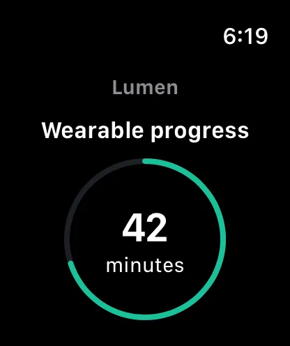
LumenWatchProgressRing(value: elapsed, maximum: threshold) {
    TimerLabel()
}
Reference
The primary shared and platform-specific options exposed by LumenWatchProgressRing.
| API | Values or type | Default | Description |
|---|---|---|---|
| value | Finite numeric value | Required | Provides current progress. |
| maximum | Positive numeric value | 1 | Defines the upper bound. |
| tone | brand · accent · success · warning · danger · neutral | brand | Applies semantic progress color. |
| lineWidth | Native display units | 4 | Controls the clamped ring stroke. |
| content | Native view slot | Required | Provides application-owned center content. |
Native behavior
Use for short at-a-glance progress. Keep long-running background work, Always On policy, and timeline updates application-owned.
Exposes a normalized progress range while application-owned inner content retains its own readable semantics.
Shared component