When to use it
Use for an immediately applied Boolean setting. Use a button when an action does not represent persistent on/off state.
Apple availability
Import LumenUI in the target that uses this component. iPad support follows the iOS package baseline and uses native iPad layout behavior.
Native example
Use for an immediately applied Boolean setting. Use a button when an action does not represent persistent on/off state.
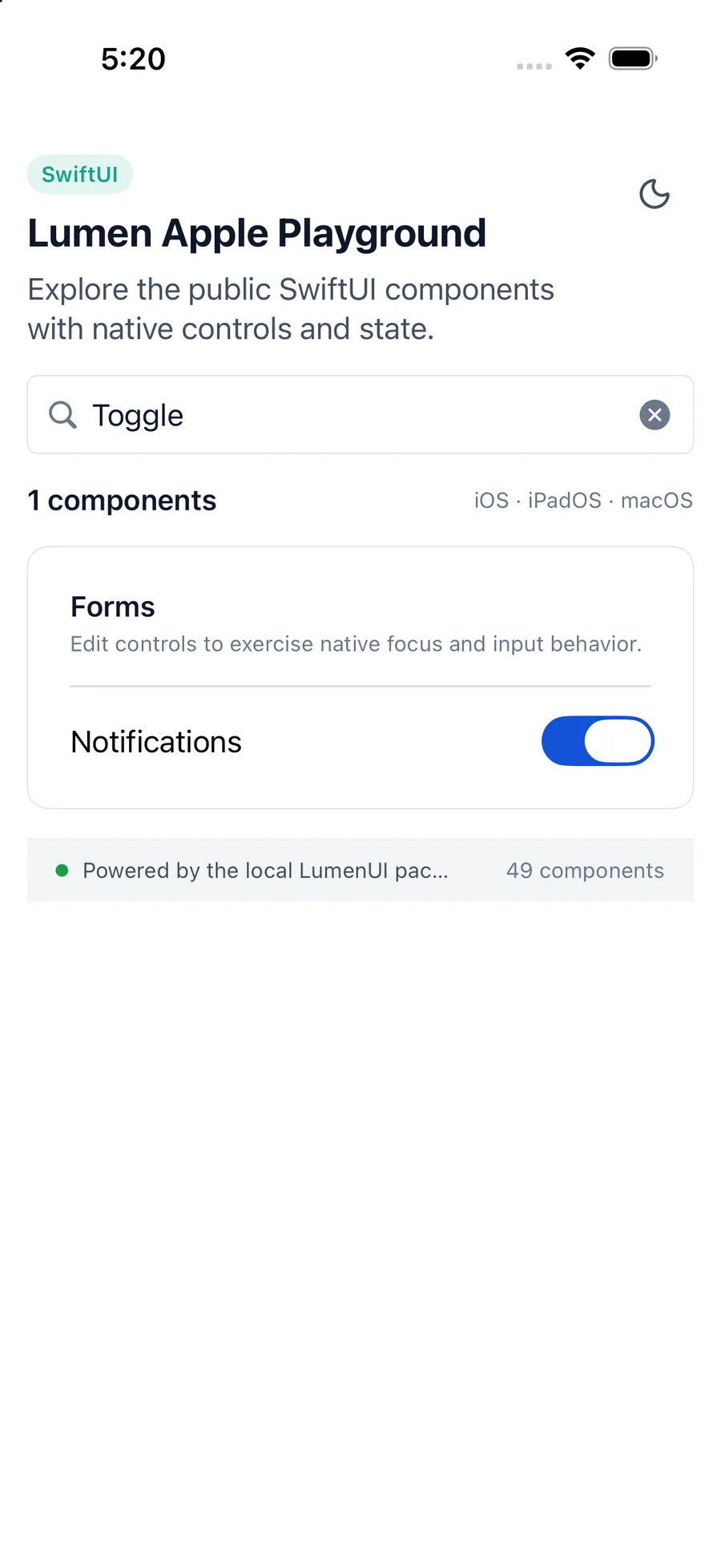
LumenToggle("Automatic updates", isOn: $automaticUpdates)Reference
The primary shared and platform-specific options exposed by LumenToggle.
| API | Values or type | Default | Description |
|---|---|---|---|
| isOn | Binding<Bool> | Required | Stores native on/off state. |
| label | LocalizedStringKey or custom View | Required | Provides the visible and accessible label. |
| Binding setter | (Boolean) -> Unit | Required | Updates the controlled state. |
| .labelsHidden() | Boolean | true | Can visually hide a repeated label while preserving its accessible name. |
| enabled | Boolean | true | Controls native disabled state. |
Native behavior
Use for an immediately applied Boolean setting. Use a button when an action does not represent persistent on/off state.
The visible label and native switch expose standard platform state and activation behavior.
Shared component