When to use it
Use a divider only when spacing and grouping are insufficient to communicate a boundary. Avoid creating dense grids of lines.
Separate related native content with the shared semantic line role.
Apple availability
Import LumenUI in the target that uses this component. iPad support follows the iOS package baseline and uses native iPad layout behavior.
Native example
Use a divider only when spacing and grouping are insufficient to communicate a boundary. Avoid creating dense grids of lines.
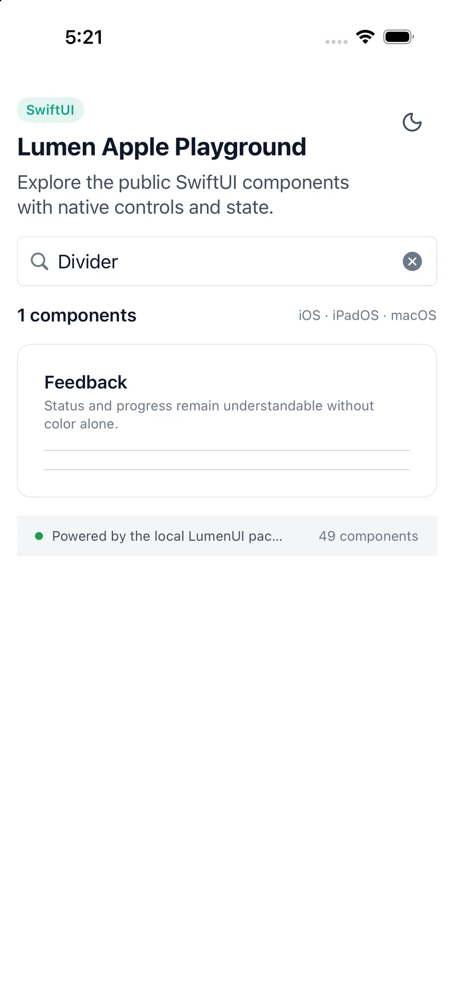
LumenDivider()Reference
The primary shared and platform-specific options exposed by LumenDivider.
| API | Values or type | Default | Description |
|---|---|---|---|
| SwiftUI modifiers | Native layout API | — | Controls placement and length. |
| color | Semantic line role | line | Uses the generated divider color. |
Native behavior
Use a divider only when spacing and grouping are insufficient to communicate a boundary. Avoid creating dense grids of lines.
The divider is decorative and is hidden from assistive technology.
Shared component