When to use it
Use for native date input that needs Lumen supporting and validation context. SwiftUI also supports time and combined date-time input.
Apple availability
Import LumenUI in the target that uses this component. iPad support follows the iOS package baseline and uses native iPad layout behavior.
Native example
Use for native date input that needs Lumen supporting and validation context. SwiftUI also supports time and combined date-time input.
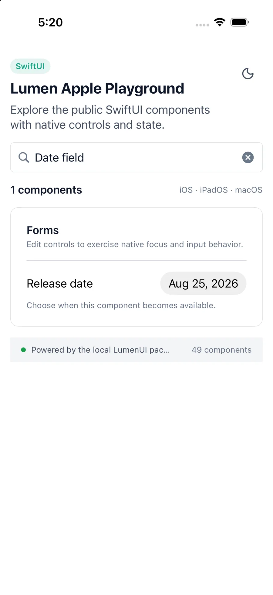
LumenDateField(
    "Release date",
    selection: $releaseDate,
    components: .dateAndTime,
    bounds: .from(.now),
    description: "Choose when this version becomes available."
)
Reference
The primary shared and platform-specific options exposed by LumenDateField.
| API | Values or type | Default | Description |
|---|---|---|---|
| title | LocalizedStringKey | Required | Labels the native date picker. |
| selection | Binding<Date> | Required | Stores the selected native date value. |
| components | date · dateAndTime · time | date | Chooses the visible date and time parts. |
| bounds | unbounded · closed · from · through | unbounded | Constrains selection using native picker bounds. |
| description / errorMessage | LocalizedStringKey? | nil | Shows supporting text or a semantic danger validation message. |
Native behavior
Use for native date input that needs Lumen supporting and validation context. SwiftUI also supports time and combined date-time input.
The native picker retains its label and adjustable behavior. Supporting or validation text remains visible in the same contained group.
Shared component