When to use it
Use when several controls share one label or validation message. Do not use it to duplicate a label already owned by one Text field or Textarea.
Compose related native controls under one label, description, required state, and validation message.
Apple availability
Import LumenUI in the target that uses this component. iPad support follows the iOS package baseline and uses native iPad layout behavior.
Native example
Use when several controls share one label or validation message. Do not use it to duplicate a label already owned by one Text field or Textarea.
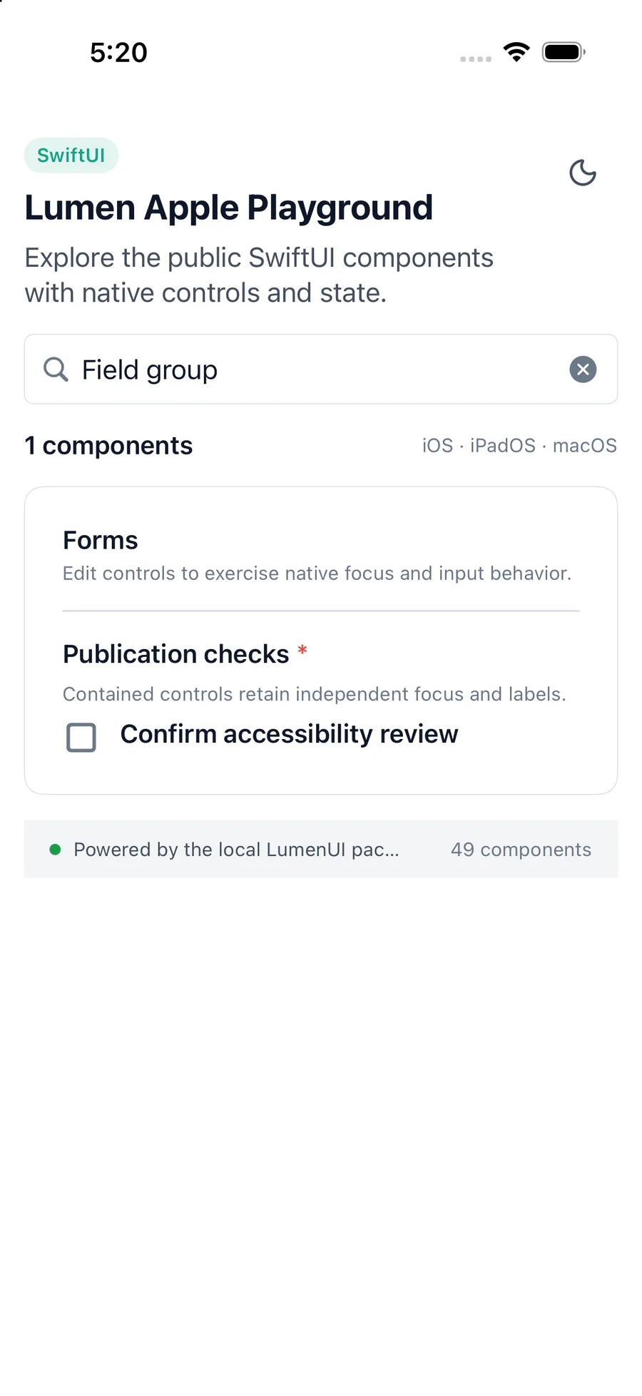
LumenFieldGroup(
    "Notification channels",
    description: "Choose every channel the team should use.",
    required: true
) {
    NotificationControls()
}
Reference
The primary shared and platform-specific options exposed by LumenFieldGroup.
| API | Values or type | Default | Description |
|---|---|---|---|
| label | String | Required | Names the grouped field controls. |
| description | String? | nil | Adds shared supporting guidance. |
| errorMessage | String? | nil | Adds a shared validation message. |
| required | Boolean | false | Shows that the grouped answer is required. |
| content | Native content | Required | Provides independently accessible controls. |
Native behavior
Use when several controls share one label or validation message. Do not use it to duplicate a label already owned by one Text field or Textarea.
The label and messages provide context without merging the semantics of contained native controls or their actions.
Shared component