When to use it
Use for a small set of related actions. Do not use it for single selection; use Segmented control or Radio group instead.
Lay out a small set of related native actions horizontally or vertically.
Apple availability
Import LumenUI in the target that uses this component. iPad support follows the iOS package baseline and uses native iPad layout behavior.
Native example
Use for a small set of related actions. Do not use it for single selection; use Segmented control or Radio group instead.
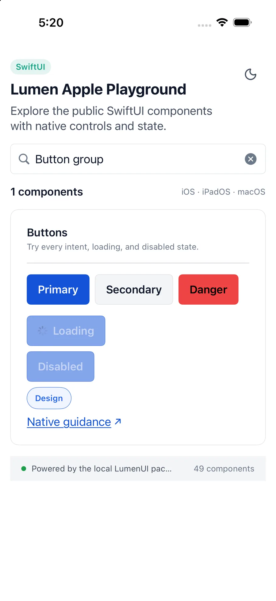
LumenButtonGroup {
    LumenButton("Save", action: save)
    LumenButton("Cancel", intent: .secondary, action: cancel)
}
Reference
The primary shared and platform-specific options exposed by LumenButtonGroup.
| API | Values or type | Default | Description |
|---|---|---|---|
| orientation | horizontal · vertical | horizontal | Controls action layout. |
| content | Native buttons | Required | Provides independently operable actions. |
Native behavior
Use for a small set of related actions. Do not use it for single selection; use Segmented control or Radio group instead.
The group contains each native button without combining action names or changing activation behavior.
Shared component