When to use it
Use for optional supporting detail within the current screen. Keep navigation and multi-step application structure in platform navigation containers.
Reveal optional native content through a controlled, accessible disclosure trigger.
Apple availability
Import LumenUI in the target that uses this component. iPad support follows the iOS package baseline and uses native iPad layout behavior.
Native example
Use for optional supporting detail within the current screen. Keep navigation and multi-step application structure in platform navigation containers.
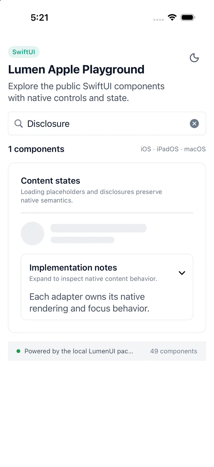
LumenDisclosure(
    "Implementation notes",
    isExpanded: $isExpanded
) {
    LumenText("Native details")
}
Reference
The primary shared and platform-specific options exposed by LumenDisclosure.
| API | Values or type | Default | Description |
|---|---|---|---|
| title | String | Required | Names the disclosure trigger. |
| isExpanded | Binding<Bool> | Required | Stores the controlled expanded state. |
| Binding setter | (Boolean) -> Unit | Required | Updates the controlled state. |
| description | String? | nil | Adds concise supporting copy to the trigger. |
| isEnabled | Boolean | true | Controls native disabled state. |
| content | Native content | Required | Provides content that is mounted only while expanded. |
Native behavior
Use for optional supporting detail within the current screen. Keep navigation and multi-step application structure in platform navigation containers.
The native trigger exposes expanded or collapsed state. Collapsed content leaves the accessibility and focus trees.
Shared component