Add the Swift package
In Xcode, choose File → Add Package Dependencies, paste the repository URL, and pin exact version 2.1.0 for reproducible builds. Use a compatible-version rule only when the application accepts compatible updates.
Share a Lumen design language across iPhone, iPad, Mac, Apple TV, and Apple Watch while keeping SwiftUI behavior native.
LumenUILumenUI installs through Swift Package Manager; no npm package, CocoaPod, or copied source is required. Add the repository URL, pin exact version 2.1.0 for reproducible builds, and attach the LumenUI product to your application target.
Get started
LumenUI installs through Swift Package Manager; no npm package, CocoaPod, or copied source is required. Add the repository URL, pin exact version 2.1.0 for reproducible builds, and attach the LumenUI product to your application target.
In Xcode, choose File → Add Package Dependencies, paste the repository URL, and pin exact version 2.1.0 for reproducible builds. Use a compatible-version rule only when the application accepts compatible updates.
Select the LumenUI library product and attach it to the application target that renders your SwiftUI views.
Import LumenUI, wrap the root surface in lumenTheme, select a simulator, and press Run.
# Xcode → File → Add Package Dependencies…
https://github.com/santi020k/lumen

# Dependency Rule
Exact Version: 2.1.0

# Add this product to your application target
LumenUI// Package.swift
dependencies: [
.package(
url: "https://github.com/santi020k/lumen",
exact: "2.1.0"
)
],
targets: [
.target(
name: "YourApp",
dependencies: [
.product(name: "LumenUI", package: "lumen")
]
)
]import LumenUI
@main
struct ExampleApp: App {
var body: some Scene {
WindowGroup {
LumenSurface {
LumenText("Welcome", variant: .title)
LumenButton("Continue", action: continueFlow)
}
.lumenTheme(.light)
}
}
}Try every component
The Apple gallery runs as an iOS app from Xcode and as a macOS Swift Package executable. Choose an iPhone simulator and press Run; signing is not required for the simulator.
Version 1.0 is available for iPhone, iPad, and Mac. The same listing installs the native gallery for the Apple device you are using.
git clone https://github.com/santi020k/lumen.git
cd lumen
open apps/playground-apple/LumenApplePlayground.xcodeprojpnpm playground:apple:build
swift run --package-path apps/playground-apple LumenApplePlaygroundYou can run the gallery locally before configuring any store account.
Appearance
Apply one built-in Lumen theme to the root content view. The modifier shares semantic colors through the SwiftUI environment and sets the matching preferred color scheme for native controls, sheets, and system surfaces.
WindowGroup {
    AppRoot()
        .lumenTheme(.light)
}@AppStorage("useDarkAppearance") private var useDarkAppearance = false
var body: some Scene {
WindowGroup {
AppRoot()
.lumenTheme(useDarkAppearance ? .dark : .light)
}
}Use Lumen semantic colors through public components instead of styling each control independently. The selected theme also keeps SF Symbols, native controls, and presented views aligned with the same appearance.
Continue with AI
Install the portable skill once, open your application in a compatible coding tool, and name the target platform in the request. The skill reads the native package and documentation before selecting components.
npx skills add santi020k/lumen --skill lumen-uinpx skills add santi020k/lumen --skill lumen-uiFollow the installer prompts and select the AI coding tools available on your machine.
Use $lumen-ui to build this screen in SwiftUI.
Use the LumenUI Swift package and public SwiftUI components.
Preserve native navigation and state, and include loading, empty, error, Dynamic Type, and VoiceOver behavior.
Use $lumen-ui to build this screen in SwiftUI.
Use the LumenUI Swift package and public SwiftUI components.
Preserve native navigation and state, and include loading, empty, error, Dynamic Type, and VoiceOver behavior.Review the generated package imports, component states, and platform accessibility behavior.
The Agent Skill and optional MCP server cover web and native adapters. MCP can list the components available for this platform and return installation, setup, API examples, accessibility guidance, and reference source for each documented native component.
Open the complete AI setup guideReal platform output
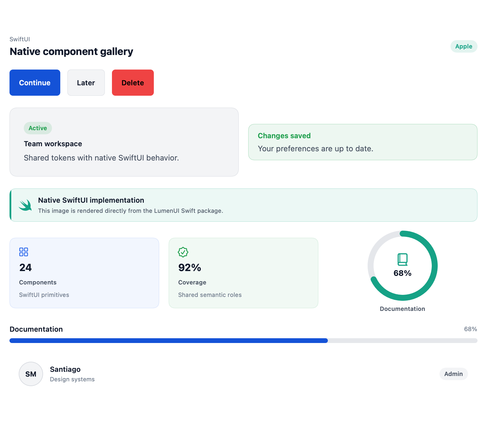
This verified capture comes from the native preview host using the package in this repository. The controls are rendered by Apple, not by HTML.
Supported surface
The shared native tier is complemented by SwiftUI and macOS-specific controls that preserve native navigation, focus, and window behavior.
Platform contract
The package supports iOS 16, macOS 13, tvOS 16, visionOS 1, and watchOS 9 or newer.
Controls automatically use touch-friendly mobile density and compact pointer-friendly Mac density.
Dynamic Type, SF Symbols, environment values, VoiceOver, and native controls remain first-class.
Move between platform guidance without losing the shared Lumen design language.