When to use it
Use for a short set of contextual actions. Keep labels unique and concise, and do not hide a screen's only primary action inside a menu.
Present a native anchored action menu with shared item-state semantics.
Apple availability
Import LumenUI in the target that uses this component. iPad support follows the iOS package baseline and uses native iPad layout behavior.
Native example
Use for a short set of contextual actions. Keep labels unique and concise, and do not hide a screen's only primary action inside a menu.
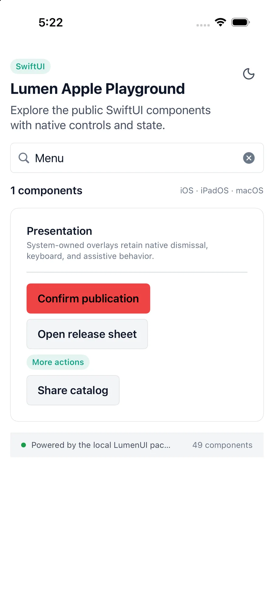
LumenMenu(items: actions) {
    Label("More", systemImage: "ellipsis")
}
Reference
The primary shared and platform-specific options exposed by LumenMenu.
| API | Values or type | Default | Description |
|---|---|---|---|
| items | Native Lumen menu item collection | Required | Provides labeled actions and states. |
| Native Menu state | Native | Collapsed | Controls or reports native menu presentation. |
| disabled | Boolean | false | Keeps an unavailable item readable but inactive. |
| destructive / role | Destructive action role | false / nil | Marks a destructive action semantically and visually. |
Native behavior
Use for a short set of contextual actions. Keep labels unique and concise, and do not hide a screen's only primary action inside a menu.
The trigger exposes expanded state and each native menu action reports its label, disabled state, and destructive role.
Shared component