When to use it
Use default for neutral notices and semantic variants for outcomes or risk. Keep the message actionable and avoid presenting routine information as an alert.
Present inline native feedback using shared neutral, destructive, success, and warning treatments.
Apple availability
Import LumenUI in the target that uses this component. iPad support follows the iOS package baseline and uses native iPad layout behavior.
Native example
Use default for neutral notices and semantic variants for outcomes or risk. Keep the message actionable and avoid presenting routine information as an alert.
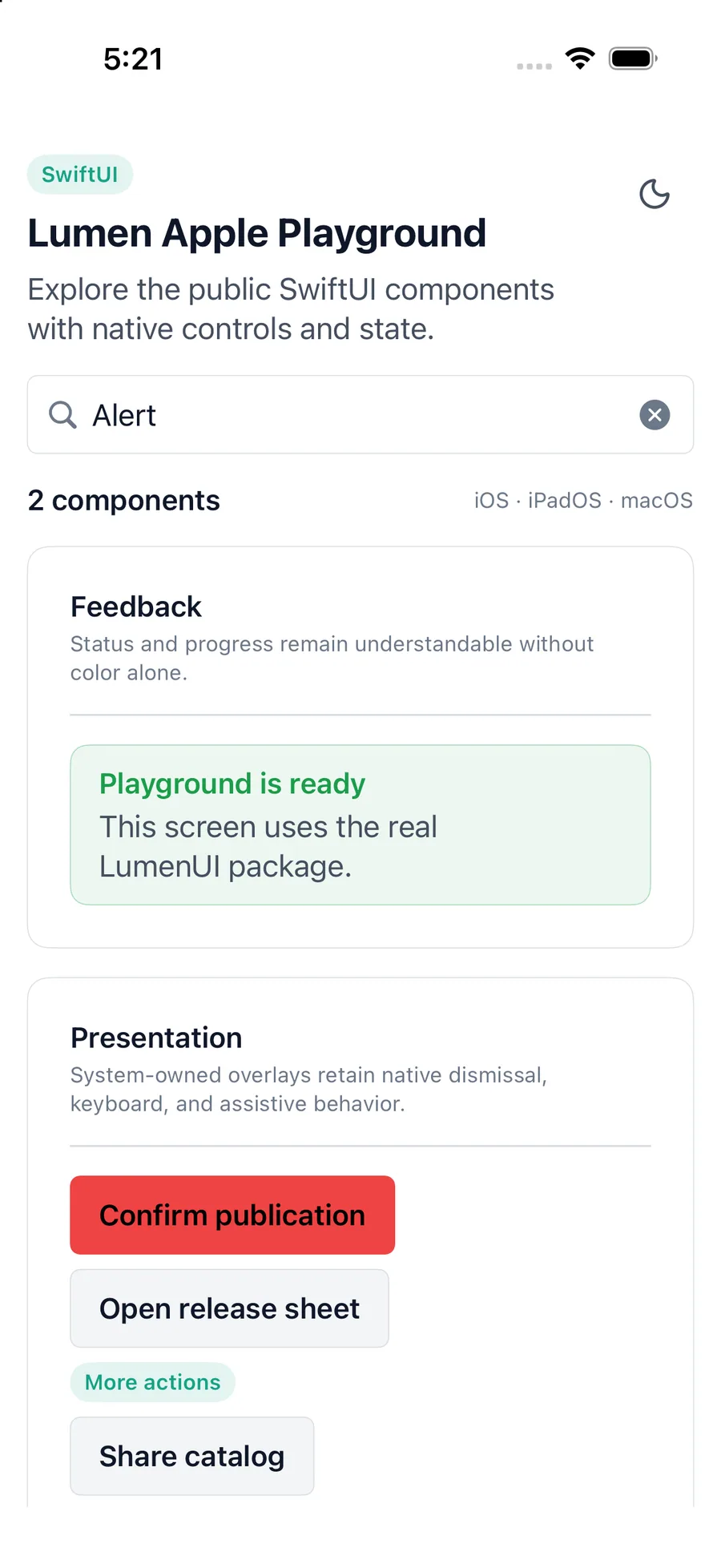
LumenAlert(variant: .success) {
    Text("Profile synced")
}
Reference
The primary shared and platform-specific options exposed by LumenAlert.
| API | Values or type | Default | Description |
|---|---|---|---|
| variant | default · destructive · success · warning | default | Selects the semantic foreground, border, and tint. |
| content | Native content | Required | Provides alert content. |
| SwiftUI modifiers | Native layout API | — | Controls placement and sizing. |
| Text | Platform text composition | — | React Native uses explicit text roles because View does not inherit text color. |
Native behavior
Use default for neutral notices and semantic variants for outcomes or risk. Keep the message actionable and avoid presenting routine information as an alert.
An alert is a styled container, not an automatic live announcement. Applications decide when asynchronous content needs a platform announcement.
Shared component