When to use it
Use when a region or page cannot show its primary content. Keep retry and request policy in application state; use Banner when existing content remains useful.
Explain an unavailable region or page and offer application-owned recovery.
Apple availability
Import LumenUI in the target that uses this component. iPad support follows the iOS package baseline and uses native iPad layout behavior.
Native example
Use when a region or page cannot show its primary content. Keep retry and request policy in application state; use Banner when existing content remains useful.
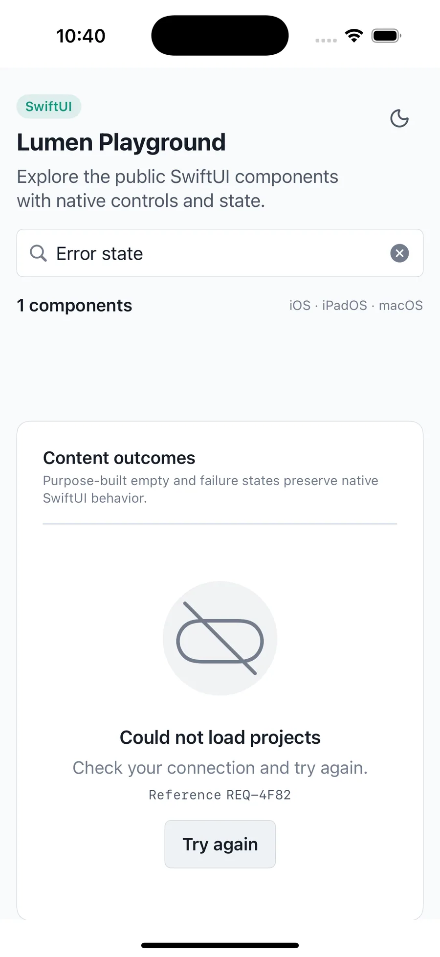
LumenErrorState(
    "Could not load projects",
    description: "Check your connection and try again.",
    kind: .offline,
    reference: "REQ-4F82"
) {
    LumenButton("Try again", action: retry)
}
Reference
The primary shared and platform-specific options exposed by LumenErrorState.
| API | Values or type | Default | Description |
|---|---|---|---|
| title | LocalizedStringKey | Required | Names the unavailable content or failed operation. |
| kind | LumenErrorStateKind | error | Selects error or offline context and its default illustration. |
| layout | LumenErrorStateLayout | default | Adapts spacing and whether the state fills its available page height. |
| reference | String? | nil | Shows a safe support reference without exposing technical details. |
| actions | @ViewBuilder () -> Actions | EmptyView | Provides application-owned recovery actions. |
Native behavior
Use when a region or page cannot show its primary content. Keep retry and request policy in application state; use Banner when existing content remains useful.
The title is a heading, recovery actions retain native focus order, and React Native and Compose expose configurable live-region behavior.
Shared component