When to use it
Use for an approximate or continuously adjustable numeric value. Prefer TextField or Picker when exact entry is more important.
Adjust a continuous or stepped numeric value with a visible formatted label.
Apple availability
Import LumenUI in the target that uses this component. iPad support follows the iOS package baseline and uses native iPad layout behavior.
Native example
Use for an approximate or continuously adjustable numeric value. Prefer TextField or Picker when exact entry is more important.
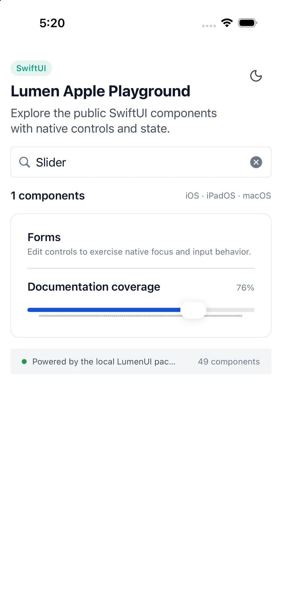
LumenSlider(
    "Minimum speed",
    value: $minimumSpeed,
    in: 1_000...5_000,
    step: 100,
    valueLabel: "\(Int(minimumSpeed)) RPM"
)
Reference
The primary shared and platform-specific options exposed by LumenSlider.
| API | Values or type | Default | Description |
|---|---|---|---|
| value | Binding<Double> | Required | Stores the current numeric value. |
| bounds | ClosedRange<Double> | Required | Defines the valid range. |
| step | Double? | nil | Adds valid stepped increments when positive and finite. |
| valueLabel | String? | nil | Shows a formatted current value. |
Native behavior
Use for an approximate or continuously adjustable numeric value. Prefer TextField or Picker when exact entry is more important.
The native slider reports its label and current value. A visible formatted value helps people understand the current setting.
Shared component