When to use it
Use default and muted cards for grouped content, and restrained semantic variants when the surface conveys a real state. Provide a card-level action only when the entire card performs one action.
Group related native content on a bordered semantic surface with optional card-level action.
Apple availability
Import LumenUI in the target that uses this component. iPad support follows the iOS package baseline and uses native iPad layout behavior.
Native example
Use default and muted cards for grouped content, and restrained semantic variants when the surface conveys a real state. Provide a card-level action only when the entire card performs one action.
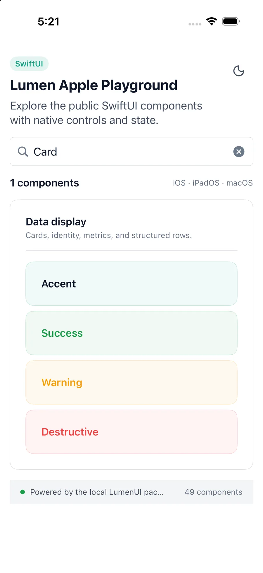
LumenCard(variant: .muted) {
    LumenText("Team workspace")
}
Reference
The primary shared and platform-specific options exposed by LumenCard.
| API | Values or type | Default | Description |
|---|---|---|---|
| variant | default · muted · accent · success · warning · destructive | default | Selects the native surface treatment. |
| action | Optional callback | nil | Makes the whole card interactive. |
| content | Native content | Required | Composes the card body. |
| SwiftUI modifiers | Native layout API | — | Controls card placement and sizing. |
Native behavior
Use default and muted cards for grouped content, and restrained semantic variants when the surface conveys a real state. Provide a card-level action only when the entire card performs one action.
Supplying an action gives the card native button semantics. Avoid nesting an interactive card inside another control.
Shared component