When to use it
Use for persistent inline notices with optional action and dismissal. Prefer Alert for compact semantic content without banner structure.
Present a structured semantic notice with optional actions and dismissal.
Apple availability
Import LumenUI in the target that uses this component. iPad support follows the iOS package baseline and uses native iPad layout behavior.
Native example
Use for persistent inline notices with optional action and dismissal. Prefer Alert for compact semantic content without banner structure.
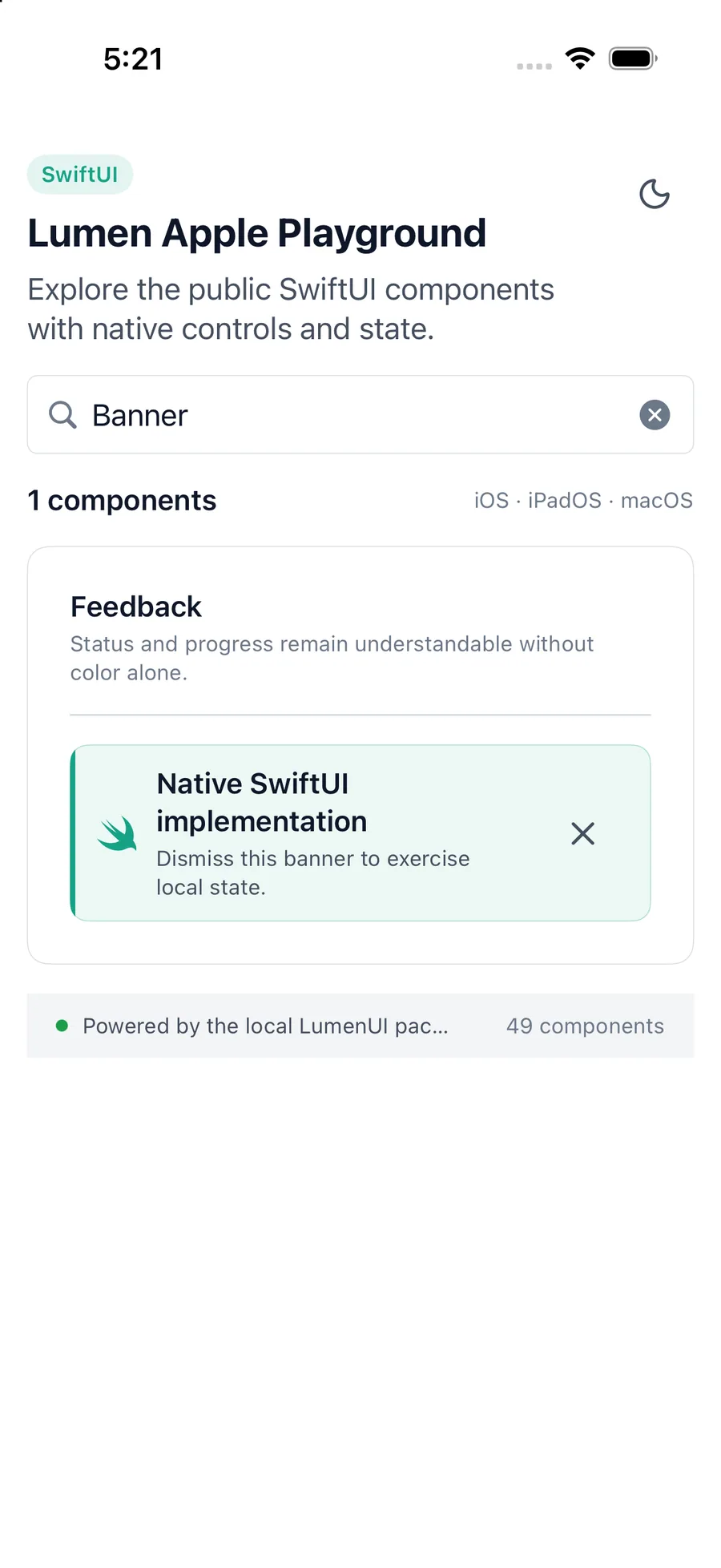
LumenBanner(
    "Workspace assigned automatically",
    description: "Moved Safari to Documentation.",
    variant: .accent,
    onDismiss: dismissAssignment
) {
    LumenButton("Undo", intent: .quiet, size: .sm, action: undo)
}
Reference
The primary shared and platform-specific options exposed by LumenBanner.
| API | Values or type | Default | Description |
|---|---|---|---|
| title | LocalizedStringKey | Required | Names the notice. |
| description | LocalizedStringKey? | nil | Adds supporting detail. |
| variant | default · accent · destructive · success · warning | default | Selects semantic presentation. |
| onDismiss | (() -> Void)? | nil | Adds a labeled dismiss action. |
| actions | @ViewBuilder () -> Actions | EmptyView | Provides optional inline actions. |
Native behavior
Use for persistent inline notices with optional action and dismissal. Prefer Alert for compact semantic content without banner structure.
A banner is inline content, not a live announcement. The application decides whether newly inserted content needs a platform announcement.
Shared component