When to use it
Keep a stable label even when placeholder text is present. Pair error styling with useful explanatory text rather than relying on color alone.
Collect a single line of text using each platform’s native input and focus behavior.
Apple availability
Import LumenUI in the target that uses this component. iPad support follows the iOS package baseline and uses native iPad layout behavior.
Native example
Keep a stable label even when placeholder text is present. Pair error styling with useful explanatory text rather than relying on color alone.
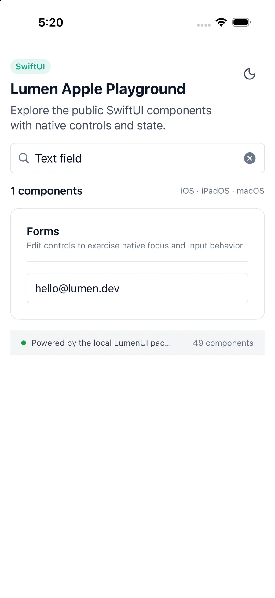
LumenTextField(
    "Email address",
    text: $email
)
Reference
The primary shared and platform-specific options exposed by LumenTextField.
| API | Values or type | Default | Description |
|---|---|---|---|
| text | Bound String | Required | Stores the current native input value. |
| Binding | Value callback / binding | Required | Updates application state. |
| title | String | Required | Names the field. |
| size | sm · md · lg | md | Selects shared control metrics. |
| error | Boolean | false | Applies the semantic invalid treatment. |
| SwiftUI .disabled | Boolean | false | Controls native editing state. |
Native behavior
Keep a stable label even when placeholder text is present. Pair error styling with useful explanatory text rather than relying on color alone.
The field remains a native input with platform focus, keyboard, autofill, and screen-reader behavior. Errors use native invalid-state semantics where available.
Shared component