When to use it
Use for a mini player, call, upload, recording, or persistent status. Keep accessory domain state and actions application-owned.
Adapt application-owned accessory content to expanded and inline tab-bar placement.
Apple availability
Import LumenUI in the target that uses this component. iPad support follows the iOS package baseline and uses native iPad layout behavior.
Native example
Use for a mini player, call, upload, recording, or persistent status. Keep accessory domain state and actions application-owned.
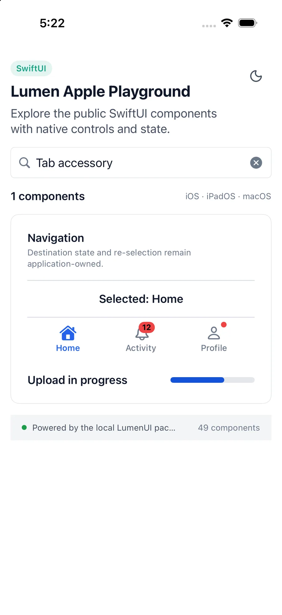
TabView {
    FeedView().tabItem { Label("Feed", systemImage: "rectangle.stack") }
}
.lumenTabViewBottomAccessory {
    LumenTabAccessory {
        ExpandedUploadStatus()
    } compact: {
        CompactUploadStatus()
    }
}
Reference
The primary shared and platform-specific options exposed by LumenTabAccessory.
| API | Values or type | Default | Description |
|---|---|---|---|
| expanded | @ViewBuilder () -> View | Required | Provides content displayed above a regular-size tab bar. |
| compact | @ViewBuilder () -> View | Required | Provides reduced content displayed inline with a minimized tab bar. |
| isEnabled | Bool | true | Controls whether the surrounding tab accessory modifier presents content. |
Native behavior
Use for a mini player, call, upload, recording, or persistent status. Keep accessory domain state and actions application-owned.
Expanded and compact content preserve their own readable labels, controls, and traversal order while SwiftUI owns placement changes.