When to use it
Use for repeated rows with a stable leading/content/trailing structure. Continue using native collection components for scrolling, selection, and navigation.
Compose a flexible native row with leading identity, content, and trailing actions.
Apple availability
Import LumenUI in the target that uses this component. iPad support follows the iOS package baseline and uses native iPad layout behavior.
Native example
Use for repeated rows with a stable leading/content/trailing structure. Continue using native collection components for scrolling, selection, and navigation.
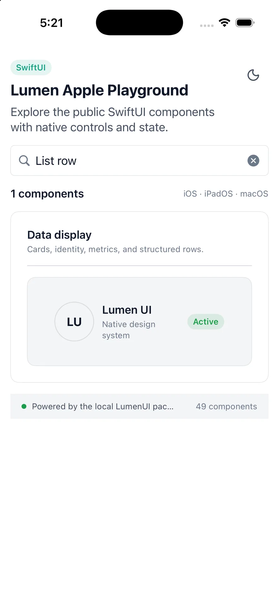
LumenListRow {
    LumenAvatar(fallback: "SM")
} content: {
    LumenText("Santiago", variant: .label)
} trailing: {
    LumenBadge("Admin")
}
Reference
The primary shared and platform-specific options exposed by LumenListRow.
| API | Values or type | Default | Description |
|---|---|---|---|
| leading | @ViewBuilder () -> Leading | Required | Provides identity or a leading visual. |
| content | @ViewBuilder () -> Content | Required | Provides the primary row content. |
| trailing | @ViewBuilder () -> Trailing | EmptyView | Provides status or compact actions. |
Native behavior
Use for repeated rows with a stable leading/content/trailing structure. Continue using native collection components for scrolling, selection, and navigation.
Leading identity, main content, and trailing actions remain contained while interactive descendants keep their own semantics.
Shared component