When to use it
Use for short consequential confirmations. Keep visibility and mutation state in the application and reserve destructive styling for irreversible or difficult-to-recover actions.
Request a controlled native confirmation with explicit cancel and confirm states.
Apple availability
Import LumenUI in the target that uses this component. iPad support follows the iOS package baseline and uses native iPad layout behavior.
Native example
Use for short consequential confirmations. Keep visibility and mutation state in the application and reserve destructive styling for irreversible or difficult-to-recover actions.
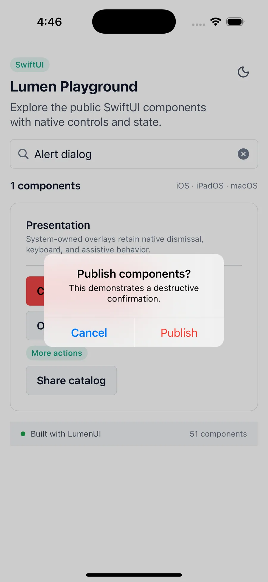
content.lumenAlertDialog(
    isPresented: $showConfirmation,
    title: "Delete report?",
    confirmLabel: "Delete",
    confirmRole: .destructive,
    onConfirm: deleteReport
)
Reference
The primary shared and platform-specific options exposed by lumenAlertDialog.
| API | Values or type | Default | Description |
|---|---|---|---|
| isPresented | Binding<Bool> | Required | Controls native modal presentation. |
| title / description | Native localized text | Description optional | Explains the decision. |
| confirmLabel / cancelLabel | Native localized text | Cancel label: Cancel | Names both actions. |
| confirmRole | ButtonRole? | nil | Communicates whether the confirm action is destructive. |
| confirmDisabled | Bool | false | Controls whether the confirm action can be activated. |
| confirmLoading | Bool | false | Communicates asynchronous confirmation progress. |
Native behavior
Use for short consequential confirmations. Keep visibility and mutation state in the application and reserve destructive styling for irreversible or difficult-to-recover actions.
Native modal focus stays inside the confirmation surface and cancel and confirm remain independently named actions.
Shared component