When to use it
Use for an independently selectable Boolean choice. Prefer Toggle when changing the value applies immediately as a setting.
Capture a controlled Boolean choice with a generous native target and supporting text.
Apple availability
Import LumenUI in the target that uses this component. iPad support follows the iOS package baseline and uses native iPad layout behavior.
Native example
Use for an independently selectable Boolean choice. Prefer Toggle when changing the value applies immediately as a setting.
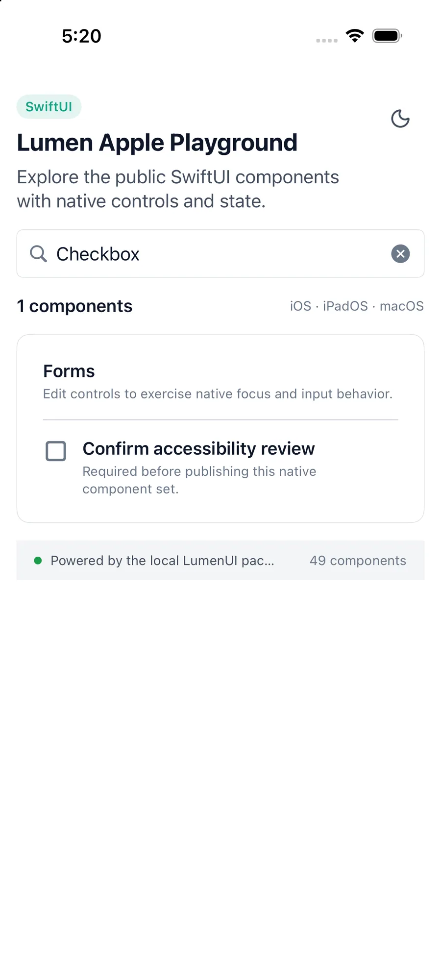
LumenCheckbox(
    "Share analytics",
    isChecked: $sharesAnalytics
)
Reference
The primary shared and platform-specific options exposed by LumenCheckbox.
| API | Values or type | Default | Description |
|---|---|---|---|
| label | String | Required | Provides the visible and accessible label. |
| isChecked | Binding<Bool> | Required | Stores the controlled checked state. |
| Binding setter | (Boolean) -> Unit | Required | Updates the controlled state. |
| description | String? | nil | Adds optional supporting text. |
| .disabled() | Boolean | false | Controls native disabled state. |
Native behavior
Use for an independently selectable Boolean choice. Prefer Toggle when changing the value applies immediately as a setting.
The full labeled row is a native checkbox target and exposes checked and disabled state without duplicating the visual indicator.
Shared component