When to use it
Use for multi-line freeform input. Prefer Text field for short single-line values and keep validation messages concise.
Capture multiline native text with shared labeling, supporting copy, and error treatment.
Apple availability
Import LumenUI in the target that uses this component. iPad support follows the iOS package baseline and uses native iPad layout behavior.
Native example
Use for multi-line freeform input. Prefer Text field for short single-line values and keep validation messages concise.
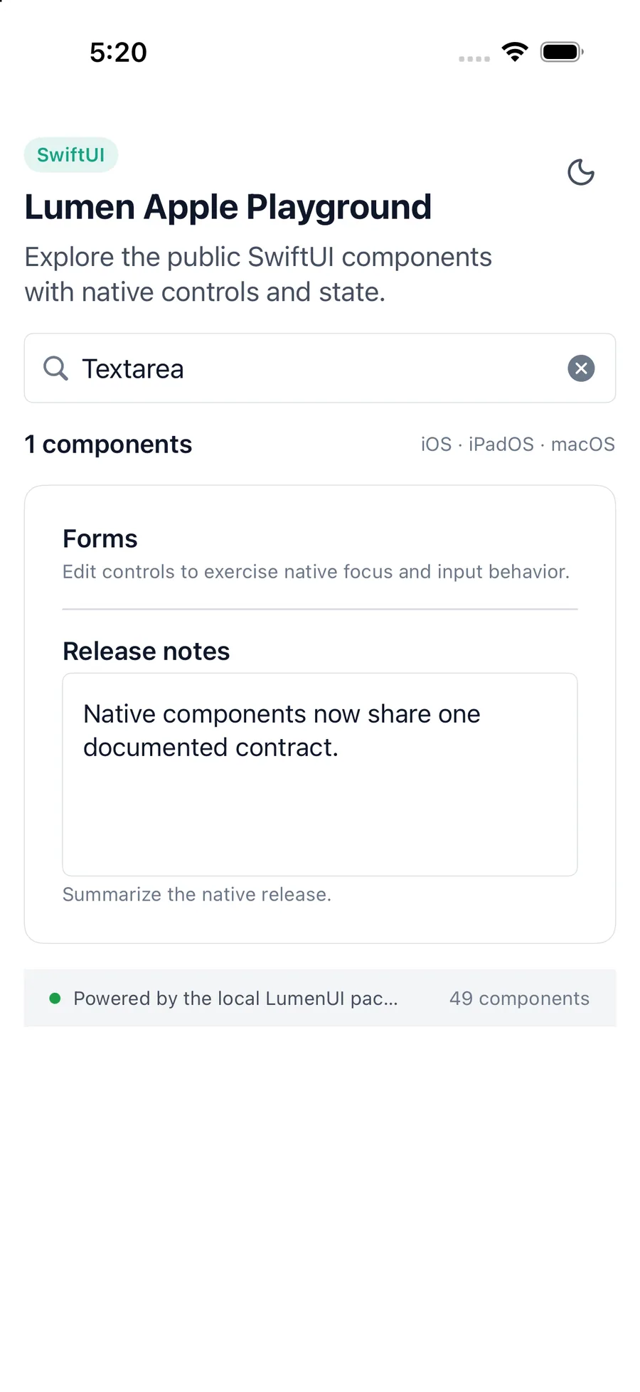
LumenTextarea(
    "Release notes",
    text: $notes,
    description: "Summarize the visible changes."
)
Reference
The primary shared and platform-specific options exposed by LumenTextarea.
| API | Values or type | Default | Description |
|---|---|---|---|
| label | String | Required | Provides the visible and accessible label. |
| text | Binding<String> | Required | Stores the controlled text value. |
| Binding setter | (String) -> Unit | Required | Updates the controlled text value. |
| description | String? | nil | Adds supporting input guidance. |
| errorMessage | String? | nil | Marks and explains an invalid value. |
Native behavior
Use for multi-line freeform input. Prefer Text field for short single-line values and keep validation messages concise.
The native multiline editor keeps platform text-entry behavior, exposes its visible label, and presents supporting or error context without replacing the current value.
Shared component