When to use it
Use primary sparingly for the main action, secondary for alternatives, quiet for low-emphasis actions, and danger for destructive operations.
Run native actions with shared intent, size, loading, and disabled contracts.
Apple availability
Import LumenUI in the target that uses this component. iPad support follows the iOS package baseline and uses native iPad layout behavior.
Native example
Use primary sparingly for the main action, secondary for alternatives, quiet for low-emphasis actions, and danger for destructive operations.
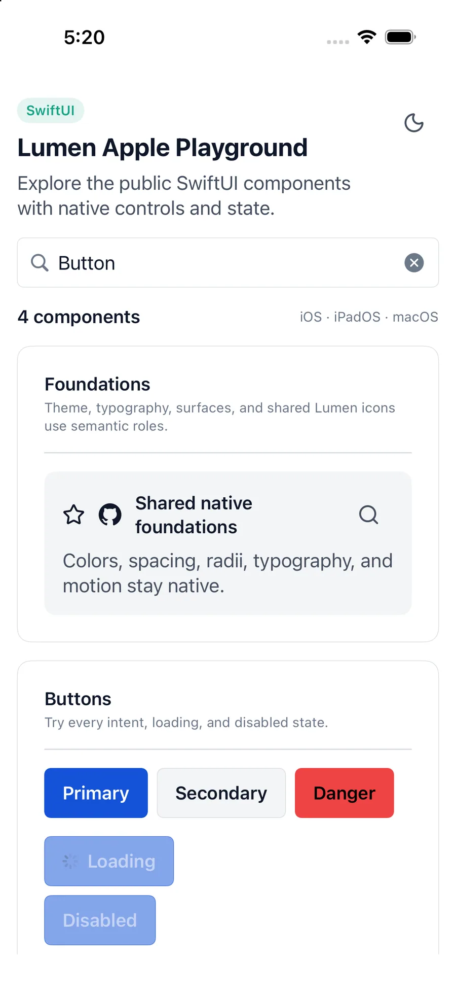
LumenButton(
    "Continue",
    intent: .primary,
    action: continueFlow
)
Reference
The primary shared and platform-specific options exposed by LumenButton.
| API | Values or type | Default | Description |
|---|---|---|---|
| action | Callback | Required | Runs the button action. |
| intent | primary · secondary · quiet · danger | primary | Selects semantic emphasis. |
| size | sm · md · lg | md | Selects shared control height and padding. |
| loading | Boolean | false | Shows native progress and prevents activation. |
| SwiftUI .disabled | Boolean | false | Controls native disabled state. |
| label | Native content | Required | Provides the visible button label. |
Native behavior
Use primary sparingly for the main action, secondary for alternatives, quiet for low-emphasis actions, and danger for destructive operations.
Disabled and loading buttons expose native state and cannot trigger their action. The visible label supplies the accessible name.
Shared component