When to use it
Use behind meaningful hero, empty-state, or highlighted content. Keep child surfaces and text on semantic tokens so contrast does not depend on the decoration.
Place a token-aware ambient pattern behind native application content.
Apple availability
Import LumenUI in the target that uses this component. iPad support follows the iOS package baseline and uses native iPad layout behavior.
Native example
Use behind meaningful hero, empty-state, or highlighted content. Keep child surfaces and text on semantic tokens so contrast does not depend on the decoration.
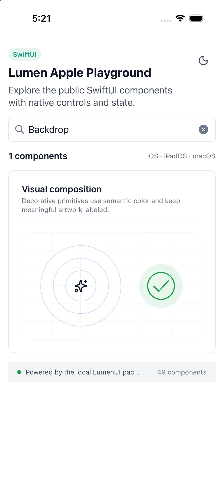
LumenBackdrop(
    intensity: .medium,
    variant: .aurora
) {
    ProjectOverview()
}
Reference
The primary shared and platform-specific options exposed by LumenBackdrop.
| API | Values or type | Default | Description |
|---|---|---|---|
| variant | aurora · dots · grid · rays | aurora | Selects the ambient pattern. |
| tone | brand · accent · neutral | brand | Selects the semantic decoration color. |
| intensity | subtle · medium · strong | medium | Controls only the decoration opacity. |
| content | Native view content | Required | Renders meaningful content above the decorative layer. |
Native behavior
Use behind meaningful hero, empty-state, or highlighted content. Keep child surfaces and text on semantic tokens so contrast does not depend on the decoration.
The ambient layer has no accessibility semantics; child content keeps its native reading order, names, and controls.
Shared component