When to use it
Use only for determinate progress. Values are clamped into the valid range; invalid maximum values fall back to 100.
Show normalized determinate progress with native accessibility semantics.
Apple availability
Import LumenUI in the target that uses this component. iPad support follows the iOS package baseline and uses native iPad layout behavior.
Native example
Use only for determinate progress. Values are clamped into the valid range; invalid maximum values fall back to 100.
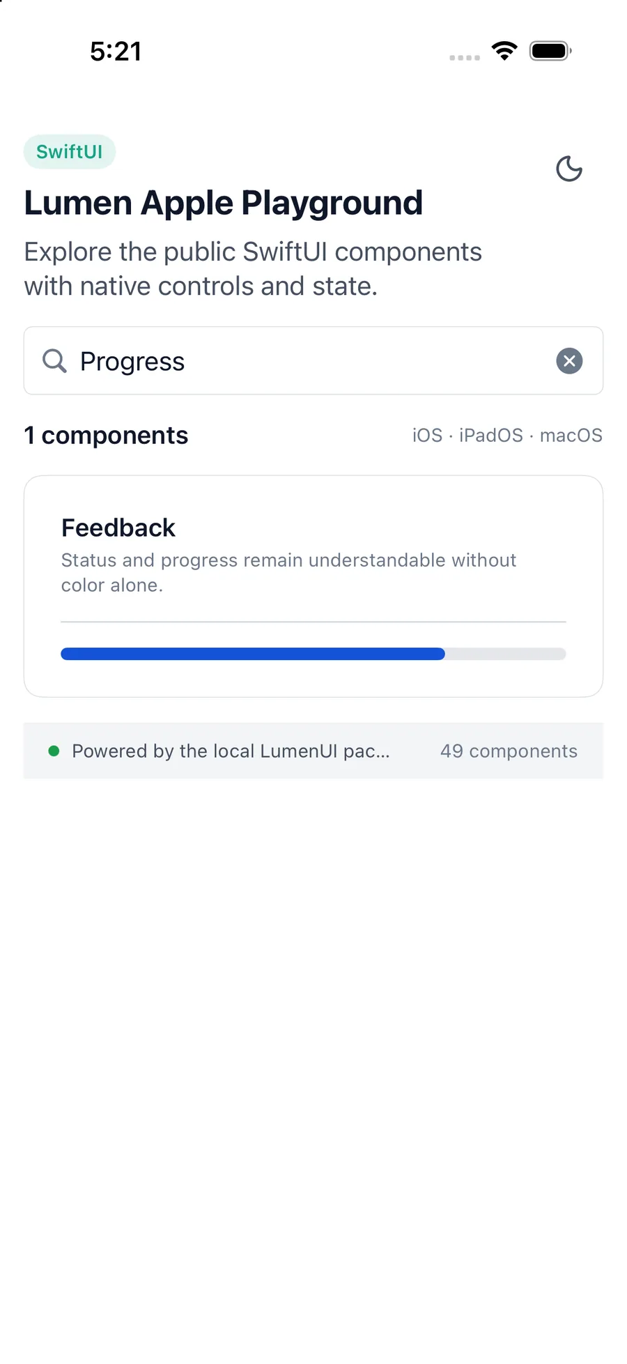
LumenProgress(
    value: 72,
    label: "Profile completion"
)
Reference
The primary shared and platform-specific options exposed by LumenProgress.
| API | Values or type | Default | Description |
|---|---|---|---|
| value | Double | 0 | Provides the current determinate value. |
| max | Double | 100 | Provides the positive maximum value. |
| label | String? | nil | Names the progress operation. |
| SwiftUI modifiers | Native presentation API | — | Adjusts native layout or optional indicator color. |
Native behavior
Use only for determinate progress. Values are clamped into the valid range; invalid maximum values fall back to 100.
Progress exposes normalized minimum, maximum, and current values. Provide a label when surrounding text does not name the operation.
Shared component