When to use it
Use the title and label roles for hierarchy, not as substitutes for application navigation semantics. Prefer the muted and soft tones for supporting copy.
Render native text with shared typography variants and semantic color tones.
Apple availability
Import LumenUI in the target that uses this component. iPad support follows the iOS package baseline and uses native iPad layout behavior.
Native example
Use the title and label roles for hierarchy, not as substitutes for application navigation semantics. Prefer the muted and soft tones for supporting copy.
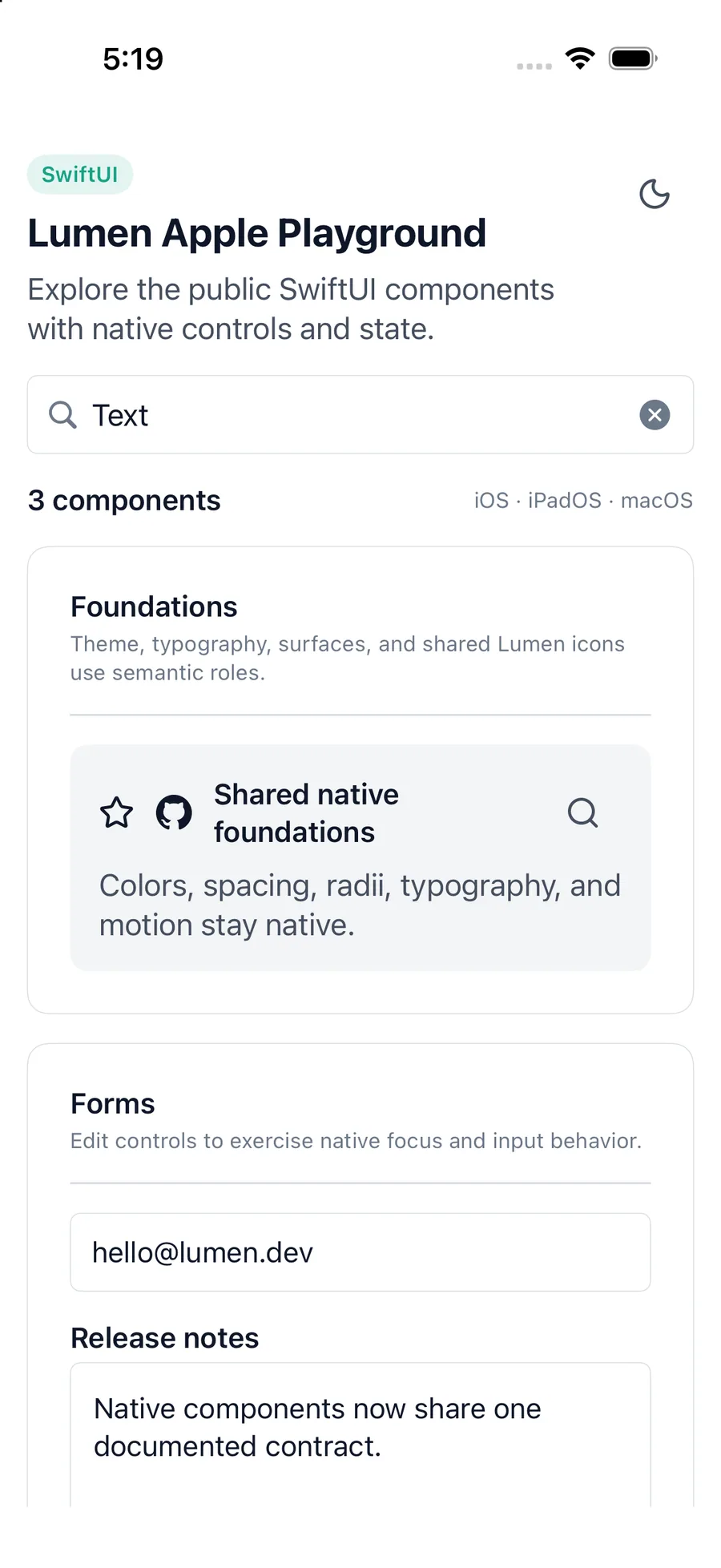
LumenText(
    "Welcome back",
    variant: .title,
    tone: .default
)
Reference
The primary shared and platform-specific options exposed by LumenText.
| API | Values or type | Default | Description |
|---|---|---|---|
| content | String / native text content | Required | The text content. |
| variant | body · caption · label · title | body | Selects the shared typography role. |
| tone | default · soft · muted · success · warning · danger | default | Selects a semantic foreground role. |
| SwiftUI modifiers | Native layout or text styling | — | Adds platform-native layout and presentation overrides. |
Native behavior
Use the title and label roles for hierarchy, not as substitutes for application navigation semantics. Prefer the muted and soft tones for supporting copy.
Text remains native text, supports platform font scaling, and preserves the semantic meaning supplied by its surrounding view.
Shared component