When to use it
Use the built-in scene when its state matches the product message. Keep it decorative when the adjacent heading and description already communicate the same status.
Render a built-in empty, success, error, or offline semantic scene.
Apple availability
Import LumenUI in the target that uses this component. iPad support follows the iOS package baseline and uses native iPad layout behavior.
Native example
Use the built-in scene when its state matches the product message. Keep it decorative when the adjacent heading and description already communicate the same status.
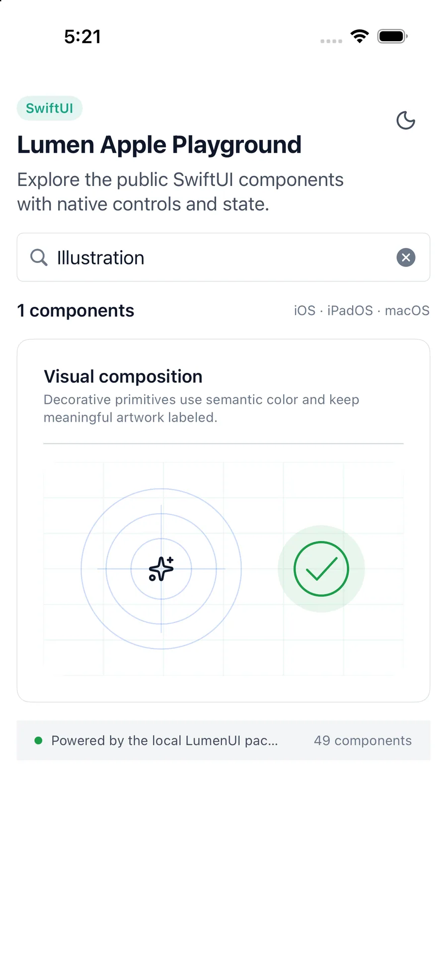
LumenIllustration(
    variant: .success,
    label: "Saved successfully"
)
Reference
The primary shared and platform-specific options exposed by LumenIllustration.
| API | Values or type | Default | Description |
|---|---|---|---|
| variant | empty · success · error · offline | empty | Selects the semantic scene. |
| tone | auto · brand · accent · neutral | auto | Uses the state color automatically or an explicit portable tone. |
| size | sm · md · lg | md | Selects the shared 96, 128, or 176 unit dimension. |
| label | String? | nil | Optionally exposes the illustration as one labeled image. |
Native behavior
Use the built-in scene when its state matches the product message. Keep it decorative when the adjacent heading and description already communicate the same status.
Illustrations are decorative by default; an optional label exposes the complete scene as one image.
Shared component