When to use it
Use the built-in scene when its state matches the product message. Keep it decorative when the adjacent heading and description already communicate the same status.
Render a built-in empty, success, error, or offline semantic scene.
Native example
Use the built-in scene when its state matches the product message. Keep it decorative when the adjacent heading and description already communicate the same status.
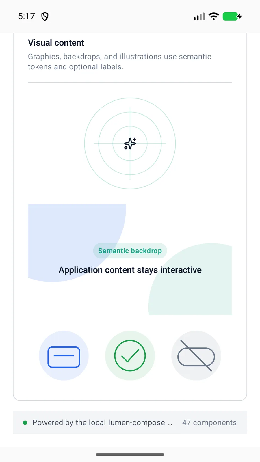
LumenIllustration(
    variant = LumenIllustrationVariant.Success,
    label = "Saved successfully"
)
Reference
The primary shared and platform-specific options exposed by LumenIllustration.
| API | Values or type | Default | Description |
|---|---|---|---|
| variant | empty · success · error · offline | empty | Selects the semantic scene. |
| tone | auto · brand · accent · neutral | auto | Uses the state color automatically or an explicit portable tone. |
| size | sm · md · lg | md | Selects the shared 96, 128, or 176 unit dimension. |
| label | String? | null | Optionally exposes the illustration as one labeled image. |
Native behavior
Use the built-in scene when its state matches the product message. Keep it decorative when the adjacent heading and description already communicate the same status.
Illustrations are decorative by default; an optional label exposes the complete scene as one image.
Shared component