When to use it
Use for one prominent Material screen action. Keep navigation bars and scaffold placement in application code.
Present a prominent Material-native action using Lumen semantic intent.
Native example
Use for one prominent Material screen action. Keep navigation bars and scaffold placement in application code.
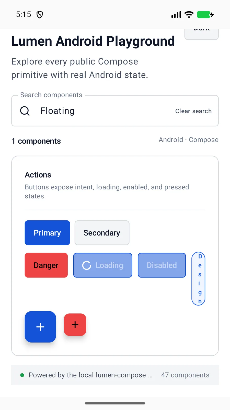
LumenFloatingActionButton(
    imageVector = Icons.Default.Add,
    contentDescription = "Create project",
    onClick = ::createProject,
    scrollState = navigationScrollState,
    navigationBehavior = LumenFloatingActionButtonNavigationBehavior.HideWithNavigation
)
Reference
The primary shared and platform-specific options exposed by LumenFloatingActionButton.
| API | Values or type | Default | Description |
|---|---|---|---|
| imageVector | ImageVector | Required | Renders the native action glyph. |
| contentDescription | String | Required | Names the icon-only action. |
| onClick | () -> Unit | Required | Runs the primary screen action. |
| intent | brand · accent · danger | brand | Selects a semantic action palette. |
| size | regular · small | regular | Selects Material-native FAB geometry. |
| navigationBehavior | alwaysVisible · hideWithNavigation · followNavigation | alwaysVisible | Keeps, hides, or repositions the action as scroll-responsive navigation changes. |
| scrollState | LumenNavigationBarScrollState? | null | Supplies the navigation visibility used by coordinated behavior. |
Native behavior
Use for one prominent Material screen action. Keep navigation bars and scaffold placement in application code.
The required content description names the icon-only action while the control preserves native Material button semantics.