When to use it
Use for an immediately applied Boolean setting. Use a button when an action does not represent persistent on/off state.
Native example
Use for an immediately applied Boolean setting. Use a button when an action does not represent persistent on/off state.
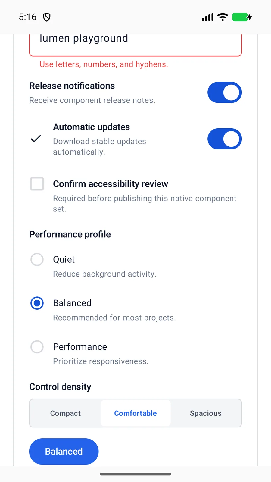
LumenToggle(
    label = "Automatic updates",
    checked = automaticUpdates,
    onCheckedChange = ::setAutomaticUpdates
)
Reference
The primary shared and platform-specific options exposed by LumenToggle.
| API | Values or type | Default | Description |
|---|---|---|---|
| checked | Boolean | Required | Stores native on/off state. |
| label | String | Required | Provides the visible and accessible label. |
| onCheckedChange | (Boolean) -> Unit | Required | Updates the controlled state. |
| showLabel | Boolean | true | Can visually hide a repeated label while preserving its accessible name. |
| enabled | Boolean | true | Controls native disabled state. |
Native behavior
Use for an immediately applied Boolean setting. Use a button when an action does not represent persistent on/off state.
The visible label and native switch expose standard platform state and activation behavior.
Shared component