When to use it
Use for a small set of peer app destinations. Keep hierarchical navigation, history, deep links, restoration, and screen rendering in the application router or native navigation stack.
Select among peer application destinations with native visuals and controlled state.
Native example
Use for a small set of peer app destinations. Keep hierarchical navigation, history, deep links, restoration, and screen rendering in the application router or native navigation stack.
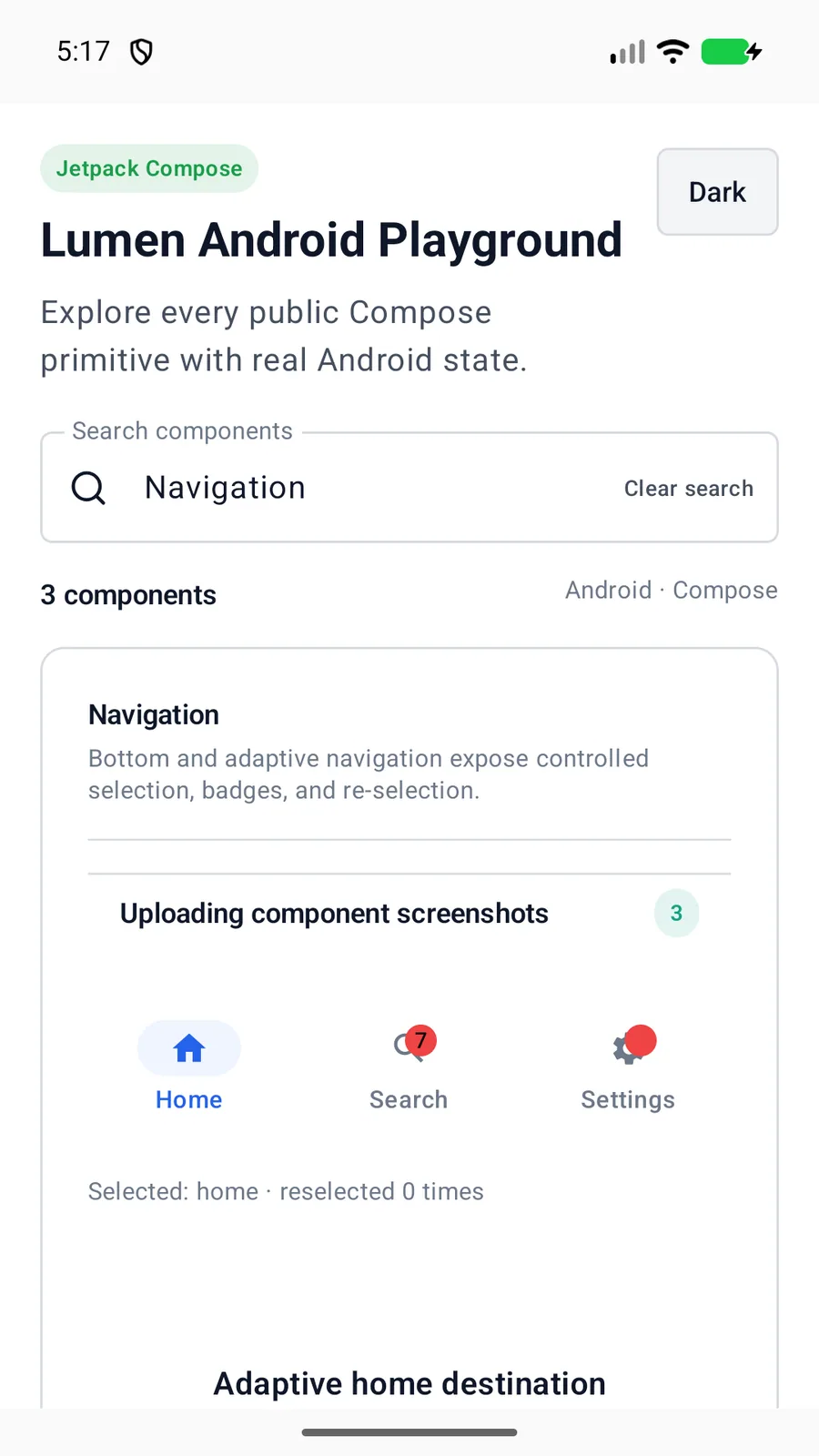
LumenNavigationBar(
    items = destinations,
    selectedValue = destination,
    onValueChange = ::setDestination,
    onReselect = ::scrollDestinationToTop
)
Reference
The primary shared and platform-specific options exposed by LumenNavigationBar.
| API | Values or type | Default | Description |
|---|---|---|---|
| items | List<LumenNavigationItem<Value>> | Required | Provides destination values, short labels, native icons, disabled state, and optional dot, text, or capped count badges. |
| selectedValue | Value | Required | Stores the active destination. |
| onValueChange | (Value) -> Unit | Required | Requests a destination change without owning navigation history. |
| onReselect | ((Value) -> Unit)? | null | Handles a second activation of the selected destination, such as scrolling to top or popping its stack. |
| accessibilityLabel | String | Primary navigation | Names the destination group for assistive technology. |
Native behavior
Use for a small set of peer app destinations. Keep hierarchical navigation, history, deep links, restoration, and screen rendering in the application router or native navigation stack.
The group has a readable navigation label and every destination exposes selected and disabled state through native tab semantics.
Shared component