When to use it
Use several decorative shapes inside one labeled loading region, or label a single skeleton when it is the only loading indicator. Do not announce every placeholder line.
Represent loading text, rectangles, and circles with quiet semantic placeholders.
Native example
Use several decorative shapes inside one labeled loading region, or label a single skeleton when it is the only loading indicator. Do not announce every placeholder line.
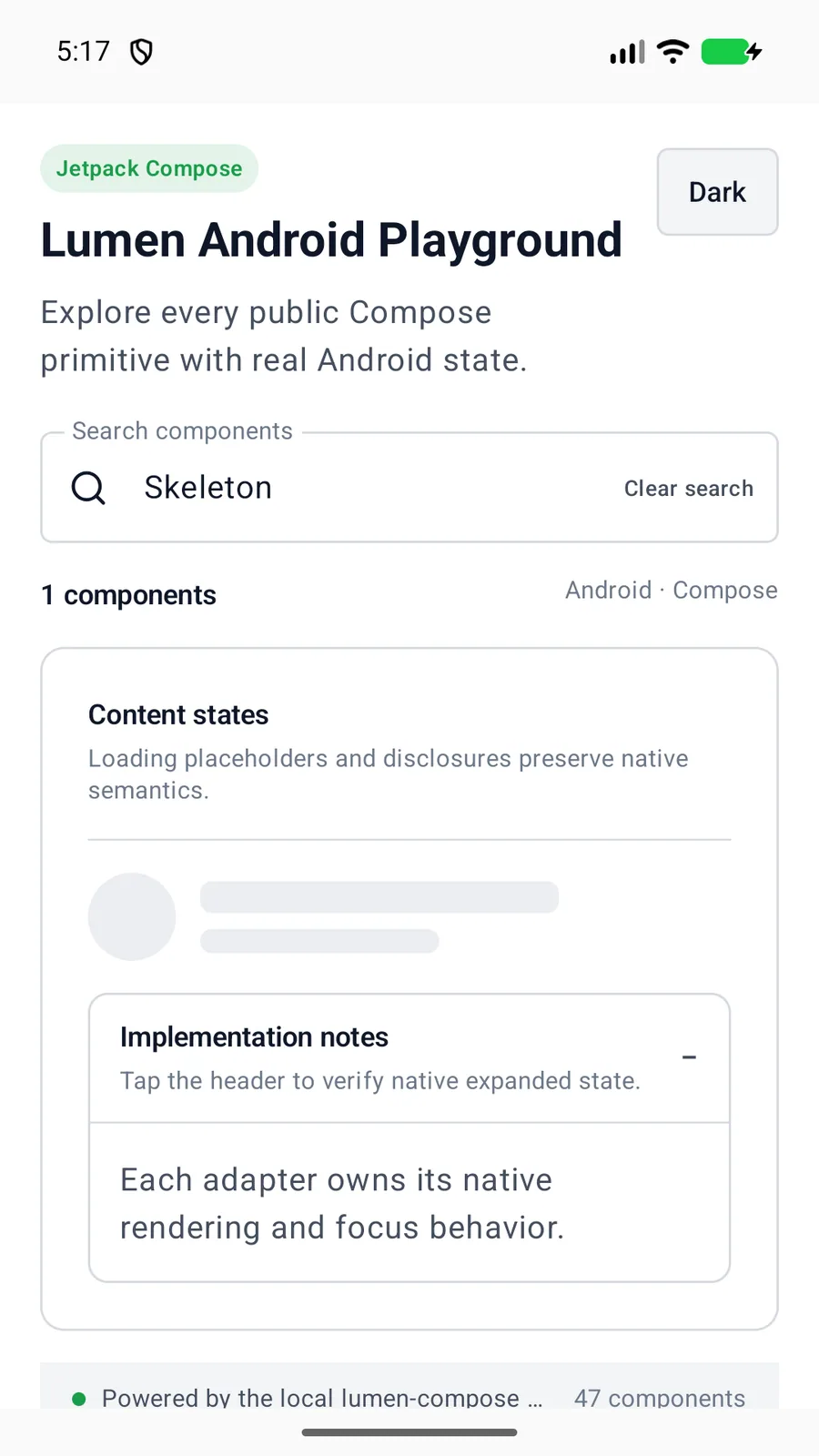
LumenSkeleton(
    height = 16.dp,
    label = "Loading profile"
)
Reference
The primary shared and platform-specific options exposed by LumenSkeleton.
| API | Values or type | Default | Description |
|---|---|---|---|
| shape | text · rectangle · circle | text | Selects the placeholder geometry. |
| width | Dp? | Fill width | Controls native width; circles use their height when omitted. |
| height | Dp | 16 | Provides a positive finite height; invalid values normalize to 16. |
| label | String? | nil | Exposes an indeterminate loading state instead of decorative content. |
Native behavior
Use several decorative shapes inside one labeled loading region, or label a single skeleton when it is the only loading indicator. Do not announce every placeholder line.
The placeholder is decorative by default. A concise label exposes one indeterminate loading state when surrounding content does not already do so.
Shared component