When to use it
Use for an approximate or continuously adjustable numeric value. Prefer TextField or Picker when exact entry is more important.
Adjust a continuous or stepped numeric value with a visible formatted label.
Native example
Use for an approximate or continuously adjustable numeric value. Prefer TextField or Picker when exact entry is more important.
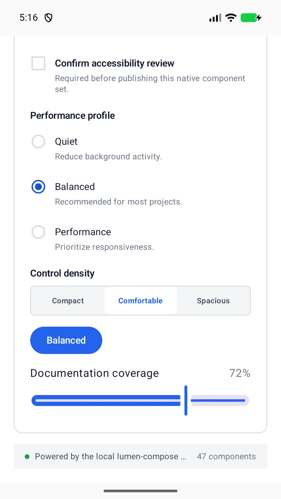
LumenSlider(
    label = "Minimum speed",
    value = minimumSpeed,
    onValueChange = ::setMinimumSpeed,
    valueRange = 1_000f..5_000f,
    steps = 39,
    valueLabel = "${minimumSpeed.toInt()} RPM"
)
Reference
The primary shared and platform-specific options exposed by LumenSlider.
| API | Values or type | Default | Description |
|---|---|---|---|
| value | Float | Required | Stores the current numeric value. |
| valueRange | ClosedFloatingPointRange<Float> | Required | Defines the valid range. |
| steps | Int | 0 | Adds valid stepped increments when positive and finite. |
| valueLabel | String | value.toString() | Shows a formatted current value. |
Native behavior
Use for an approximate or continuously adjustable numeric value. Prefer TextField or Picker when exact entry is more important.
The native slider reports its label and current value. A visible formatted value helps people understand the current setting.
Shared component