When to use it
Keep a stable label even when placeholder text is present. Pair error styling with useful explanatory text rather than relying on color alone.
Collect a single line of text using each platform’s native input and focus behavior.
Native example
Keep a stable label even when placeholder text is present. Pair error styling with useful explanatory text rather than relying on color alone.
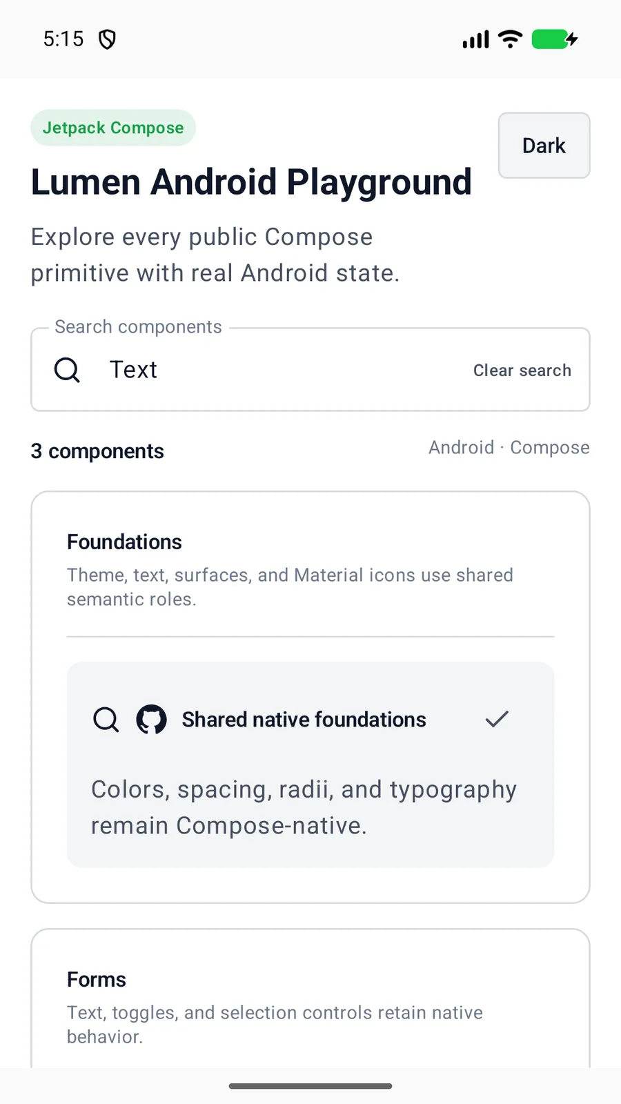
LumenTextField(
    value = email,
    onValueChange = { email = it },
    label = "Email address"
)
Reference
The primary shared and platform-specific options exposed by LumenTextField.
| API | Values or type | Default | Description |
|---|---|---|---|
| value | Bound String | Required | Stores the current native input value. |
| onValueChange | Value callback / binding | Required | Updates application state. |
| label | String | Required | Names the field. |
| size | sm · md · lg | md | Selects shared control metrics. |
| error | Boolean | false | Applies the semantic invalid treatment. |
| enabled | Boolean | true | Controls native editing state. |
Native behavior
Keep a stable label even when placeholder text is present. Pair error styling with useful explanatory text rather than relying on color alone.
The field remains a native input with platform focus, keyboard, autofill, and screen-reader behavior. Errors use native invalid-state semantics where available.
Shared component