When to use it
Use for two to four short peer options that fit comfortably on one row. Use Radio group for longer labels, descriptions, or larger sets.
Choose one value from a compact row of short peer options.
Native example
Use for two to four short peer options that fit comfortably on one row. Use Radio group for longer labels, descriptions, or larger sets.
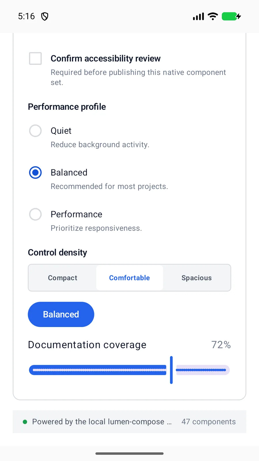
LumenSegmentedControl(
    label = "View",
    options = viewOptions,
    value = view,
    onValueChange = ::setView
)
Reference
The primary shared and platform-specific options exposed by LumenSegmentedControl.
| API | Values or type | Default | Description |
|---|---|---|---|
| label | String | Required | Names the single-selection group. |
| options | List<LumenSelectionOption> | Required | Provides the short labeled segment values. |
| value | String | Required | Stores the selected value. |
| onValueChange | (String) -> Unit | Required | Updates the selected value. |
| showLabel | Boolean | true | Controls visible label presentation while preserving the accessible group name. |
Native behavior
Use for two to four short peer options that fit comfortably on one row. Use Radio group for longer labels, descriptions, or larger sets.
Segments expose radio-style single-selection semantics inside a named group while retaining selected and disabled state.
Shared component