When to use it
Use for optional supporting detail within the current screen. Keep navigation and multi-step application structure in platform navigation containers.
Reveal optional native content through a controlled, accessible disclosure trigger.
Native example
Use for optional supporting detail within the current screen. Keep navigation and multi-step application structure in platform navigation containers.
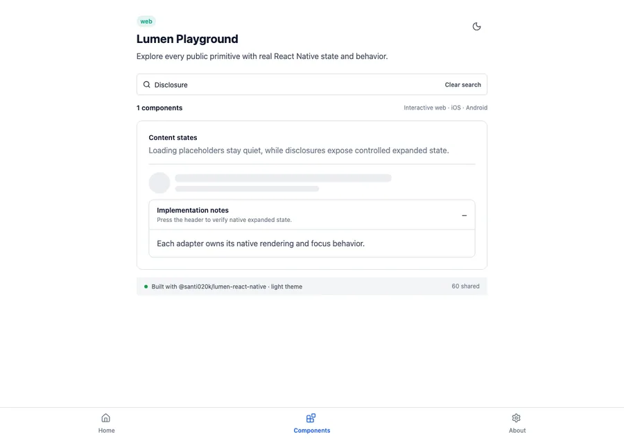
<LumenDisclosure
  title="Implementation notes"
  expanded={expanded}
  onExpandedChange={setExpanded}
>
  <LumenText>Native details</LumenText>
</LumenDisclosure>
Reference
The primary shared and platform-specific options exposed by LumenDisclosure.
| API | Values or type | Default | Description |
|---|---|---|---|
| title | String | Required | Names the disclosure trigger. |
| expanded | boolean | Required | Stores the controlled expanded state. |
| onExpandedChange | (Boolean) -> Unit | Required | Updates the controlled state. |
| description | String? | nil | Adds concise supporting copy to the trigger. |
| disabled | Boolean | false | Controls native disabled state. |
| children | Native content | Required | Provides content that is mounted only while expanded. |
Native behavior
Use for optional supporting detail within the current screen. Keep navigation and multi-step application structure in platform navigation containers.
The native trigger exposes expanded or collapsed state. Collapsed content leaves the accessibility and focus trees.
Shared component