When to use it
Use native menu or picker presentation for a compact single choice. Use Segmented control when a small peer set should remain visible.
Choose one controlled value through native or accessible menu presentation.
Native example
Use native menu or picker presentation for a compact single choice. Use Segmented control when a small peer set should remain visible.
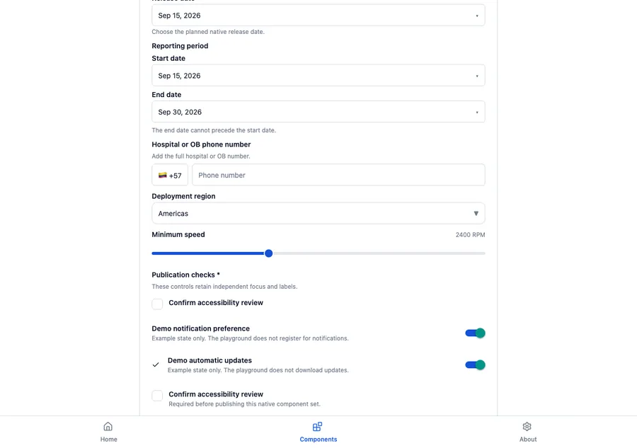
<LumenPicker
  label="Profile"
  value={profile}
  options={profileOptions}
  onValueChange={setProfile}
/>
Reference
The primary shared and platform-specific options exposed by LumenPicker.
| API | Values or type | Default | Description |
|---|---|---|---|
| value | Value extends string | number | Required | Stores the selected value. |
| options | readonly LumenPickerOption<Value>[] | Required | Provides labeled native options. |
| onValueChange | (value: Value) => void | Required | Updates the selected value. |
| enabled | boolean | true | Controls native availability or presentation. |
Native behavior
Use native menu or picker presentation for a compact single choice. Use Segmented control when a small peer set should remain visible.
The picker retains native selection semantics, keyboard behavior, and assistive-technology announcements for its selected value.
Shared component