When to use it
Use for two to five peer content views whose panel changes in place. Keep URL history and nested destination navigation in the application router; use Navigation bar for top-level app destinations.
Switch a controlled native content panel from an accessible tab list.
Native example
Use for two to five peer content views whose panel changes in place. Keep URL history and nested destination navigation in the application router; use Navigation bar for top-level app destinations.
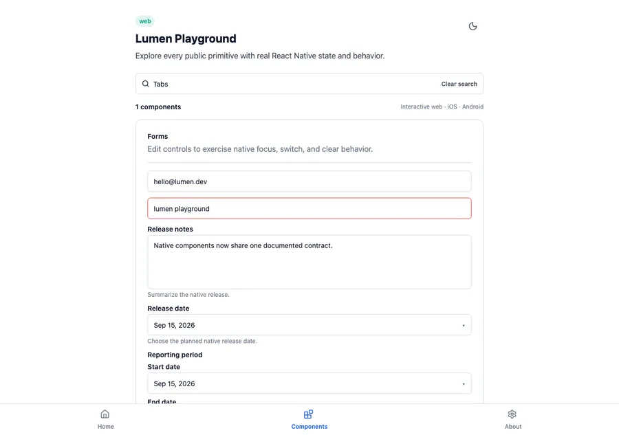
<LumenTabs
  label="Workspace views"
  options={workspaceTabs}
  value={activeTab}
  onValueChange={setActiveTab}
>
  <WorkspaceTabPanel value={activeTab} />
</LumenTabs>
Reference
The primary shared and platform-specific options exposed by LumenTabs.
| API | Values or type | Default | Description |
|---|---|---|---|
| label | String | Required | Names the tab list for assistive technology. |
| options | readonly LumenSelectionOption[] | Required | Provides stable tab values, short labels, and optional disabled state. |
| value | string | Required | Stores the active tab. |
| onValueChange | (string) => void | Required | Updates controlled tab selection. |
| children | Native content view | Required | Renders the active panel while Lumen owns the tab list and panel relationship. |
Native behavior
Use for two to five peer content views whose panel changes in place. Keep URL history and nested destination navigation in the application router; use Navigation bar for top-level app destinations.
Every tab exposes selected and disabled state, the tab list has a readable name, and the active panel is announced when selection changes.
Shared component