When to use it
Use for product imagery that needs shared fitting, aspect ratio, radius, and labeling. Keep decoding, caching, network policy, placeholders, retries, and optimizer behavior in the application or platform loader.
Present native images with shared fit, ratio, radius, and accessibility behavior.
Native example
Use for product imagery that needs shared fitting, aspect ratio, radius, and labeling. Keep decoding, caching, network policy, placeholders, retries, and optimizer behavior in the application or platform loader.
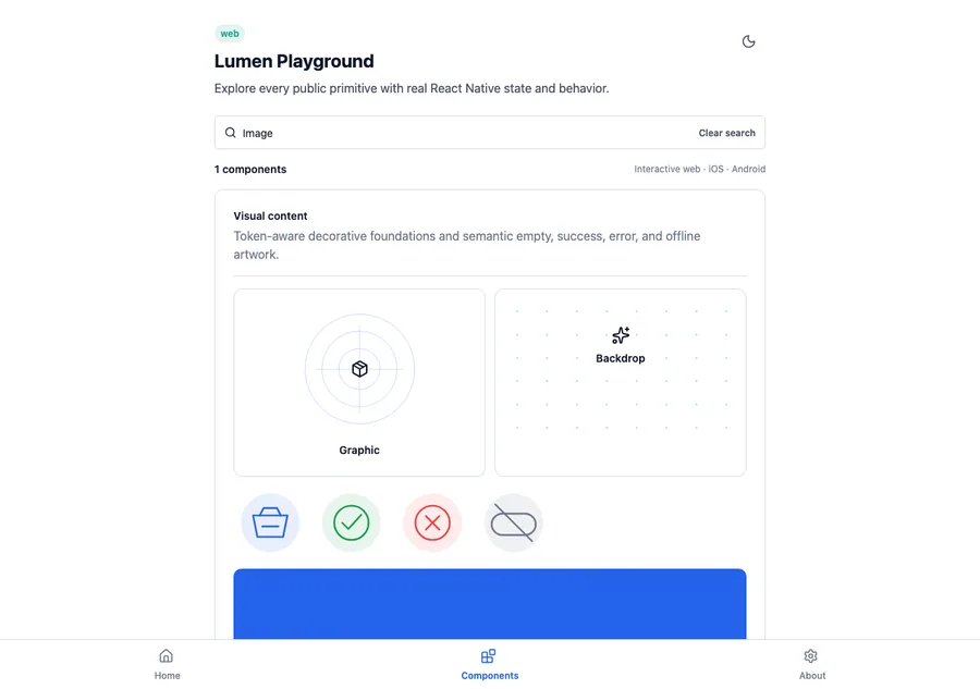
<LumenImage
  aspectRatio={16 / 9}
  fit="cover"
  label="Mountain valley at sunrise"
  source={{ uri: imageUrl }}
/>
Reference
The primary shared and platform-specific options exposed by LumenImage.
| API | Values or type | Default | Description |
|---|---|---|---|
| source | Native image source or content | Required | Supplies image pixels through the platform-native delivery path. |
| fit | contain · cover | cover | Controls how the image fits its available bounds. |
| aspectRatio | number | undefined | Reserves a positive finite width-to-height ratio when provided. |
| radius | none · sm · md · lg · full | lg | Clips the image with a shared semantic corner radius. |
| label | string | undefined | Names meaningful imagery; omit only for decorative images. |
Native behavior
Use for product imagery that needs shared fitting, aspect ratio, radius, and labeling. Keep decoding, caching, network policy, placeholders, retries, and optimizer behavior in the application or platform loader.
Images are decorative when their label is absent; a label exposes the complete image as one native accessibility element.
Shared component