When to use it
Use for compact filters, assigned values, or removable tokens. Use Badge for display-only status and Segmented control for mutually exclusive peer choices.
Represent compact selected, actionable, or removable values with native interaction semantics.
Native example
Use for compact filters, assigned values, or removable tokens. Use Badge for display-only status and Segmented control for mutually exclusive peer choices.
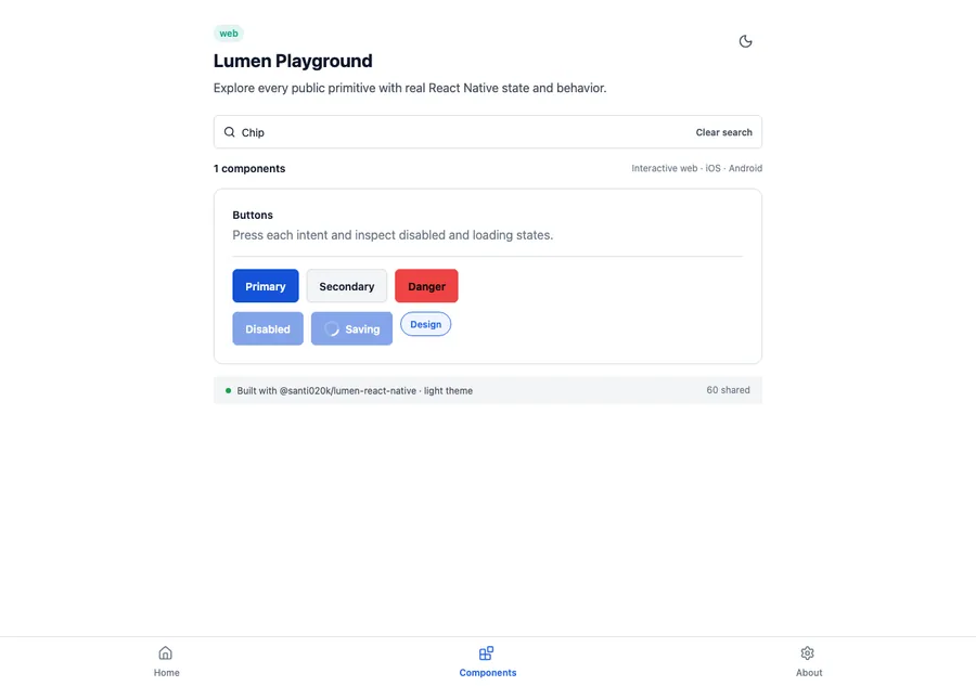
<LumenChip
  label="Design"
  selected={selected}
  onPress={() => setSelected(!selected)}
  onRemove={removeDesign}
/>
Reference
The primary shared and platform-specific options exposed by LumenChip.
| API | Values or type | Default | Description |
|---|---|---|---|
| label | String | Required | Provides visible chip text. |
| selected | Boolean | false | Exposes selected state. |
| onPress | Callback? | nil | Makes the chip selectable or actionable. |
| onRemove | Callback? | nil | Adds a separate removal action. |
| removeLabel | String | Remove label | Names the removal action. |
Native behavior
Use for compact filters, assigned values, or removable tokens. Use Badge for display-only status and Segmented control for mutually exclusive peer choices.
A selectable chip reports selected and disabled state. Its optional removal action remains separately named and operable.
Shared component